
A bold new brand identity for MW Brace
APRIL 14, 2021
A fresh new look for established Hampshire builder, MW Brace as the company continues to thrive.
Bringing a brand to life for an established building firm
Local builder, MW Brace approached us to develop a new brand at a time of strong growth for the firm. With a high demand for building work in the local area of Haslemere, Liphook, Hindhead, Farnham and beyond, and a growing customer base, including plentiful repeat business, Founder, Martin, decided the time was right to create a strong visual identity.
A strong connection since 2007
We first met Martin during a BNI networking event in the early days of both businesses, in late 2006, and at the time we supported Martin with a simple advert and business card design utilising the business name, stock image and key messages, but no logo was developed at that time. With a simple holding page, business cards and advert campaign in hand, Martin grew his business based on simple marketing techniques and word-of-mouth recommendation arising from his exceptional craftsmanship and work ethic. The simple designs we created back then stood the test of time and became the de facto logo for MW Brace, but 15 years on in 2020, it was time for something new.
A new brand and enhanced digital presence for 2020 and beyond
With word-of-mouth referrals still extremely strong, and keen to continue to grow and develop the business, Martin decided the time had come to invest in a stronger brand and digital presence for the firm, which would also be brought to life via van signwriting, workwear, site boards, stationery and more.
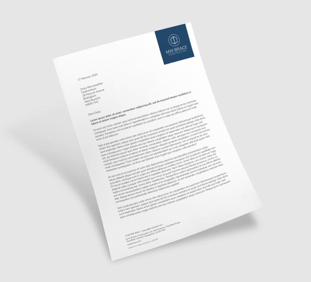
The logo and stationery were prioritised in the first instance to provide a firm foundation on which to build. Martin’s brief to us was that he wanted a simple, strong brand, leaning in to the architectural and structural elements of MW Brace’s property development, renovation and refurbishment works.
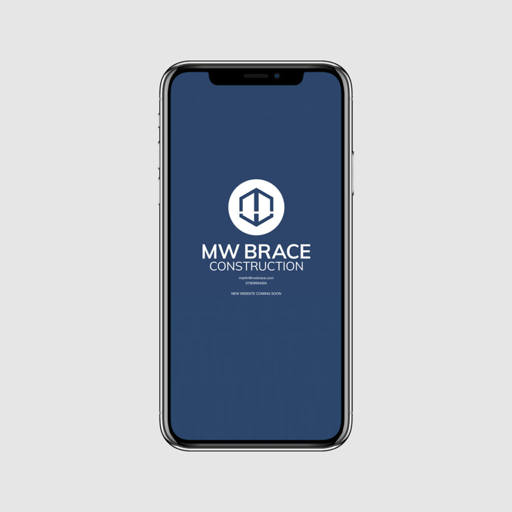
Initial concepts revealed a clear favourite which was developed further into the final logo. Fonts, a colour palette and initial roll out to stationery gave a sense of the brand taking shape. Martin had clear ideas on colour, and we were keen to explore together the use of the logo both in colour and reversed formats for maximum flexibility across roll-out.
Taking the next step with a stunning new website
Further development work continues to build the brand, with a strengthened social presence and a beautiful website currently in development. We look forward to sharing more of this exciting project as it goes live.
Watch this space at mwbrace.com
Can we help you with a project?
Address
Mzuri Design Limited
Wolfe Mead
Farnham Road
Bordon
Hampshire
GU35 0NH
Contact
+44 (0)1428 722990
hello@mzuri.co.uk
Newsletter
Your email address
Thank you