
Designed to Inspire: Album Covers
MARCH 12, 2018
This is a topic is sure to divide opinions and by no way is it a definitive list, neither is it my top 10 albums of all time as that changes on a regular basis. That is the great thing about album cover art, is that there is so much good design out there. Don’t get me wrong, there is some absolute trash too, but there is something about the medium that brings out the very best in designers.
So, what is it that makes album art so unique? I believe it’s the unique combination of the creative mind (the designer/artist), the creative client (the singer/band) and the creative consumer (you). The key word in all of this is creativity and an openness to it. The great thing about sleeve art is that the consumer has already brought into the creative mind of the musician, they love the music. I believe that it is this emotive experience that has allowed designers to produce some of the most inspirational and iconic images of modern times.
Much like the music they accompany, a great album cover transcends traditional societal restraints. Truly iconic album covers don’t just define an album, they define an era. Look at The Beatles’ Sgt Pepper’s Lonely Hearts Club album cover, and try to argue that it is not the ultimate manifestation of the “peace and love” movement of the 60s?
The rise of digital music could threaten one of the greatest canvasses of art seen in the 20th Century. But I have good reason to be hopeful it will not. Go on to any streaming service and you will see a whole host of newly designed artwork. The original purpose of the cover was just to protect the fragile goods beneath, it soon evolved into a space for artistic expression and I believe this evolution is still happening today, only now, young digital designers from around the globe can contribute to this fantastic art form.
Inspiring a young designer
Take a look at some of the album covers that have inspired me throughout my career and some that still do. The music’s not bad either!
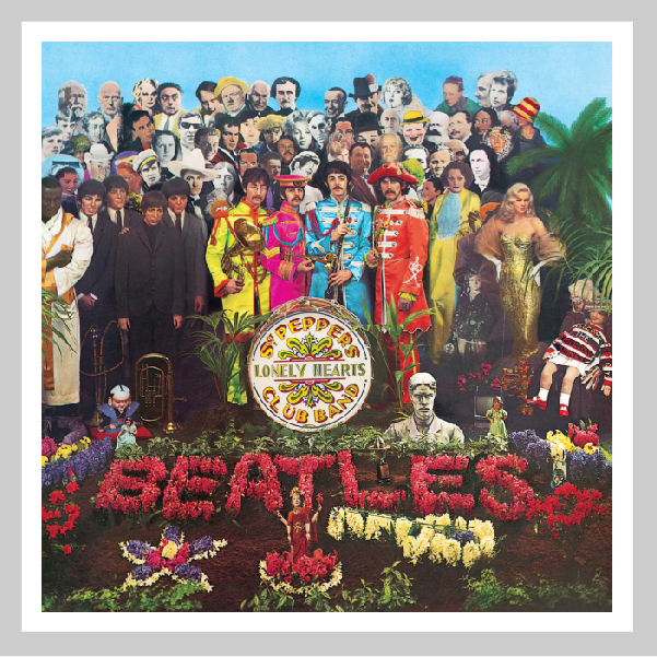
Artist: The Beatles
Album: Sgt. Pepper’s Lonely Hearts Club Band
Designer: Sir Peter Blake
An obvious choice – so heavily has it been referenced and parodied that we have forgotten just how brilliant a cover it is. Spend some time to marvel at its creative playfulness and remember, it’s a photograph, not some heavily edited and manipulated photoshop collage. Thank you Sir Peter Blake!
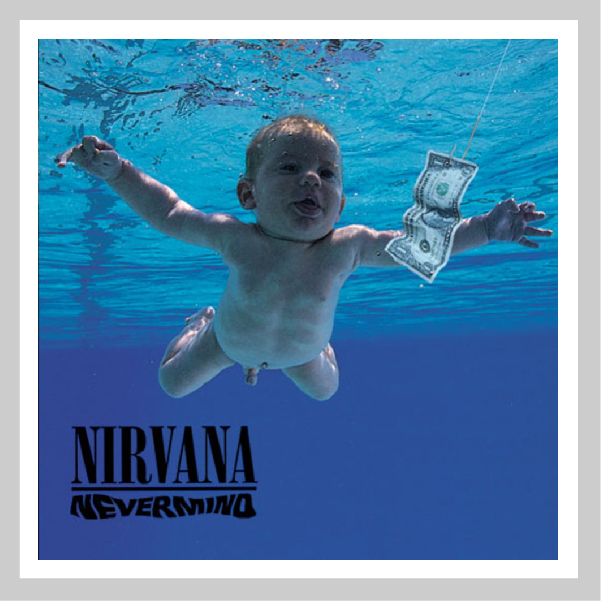
Artist: Nirvana
Album: Nevermind
Designer: Robert Fisher
The iconic image of an innocent baby swimming towards a dollar bill on a fishhook is one of the most instantly recognisable in musical history. The cover art has become as iconic as the songs, the album, the band and its infamous frontman Kurt Cobain.
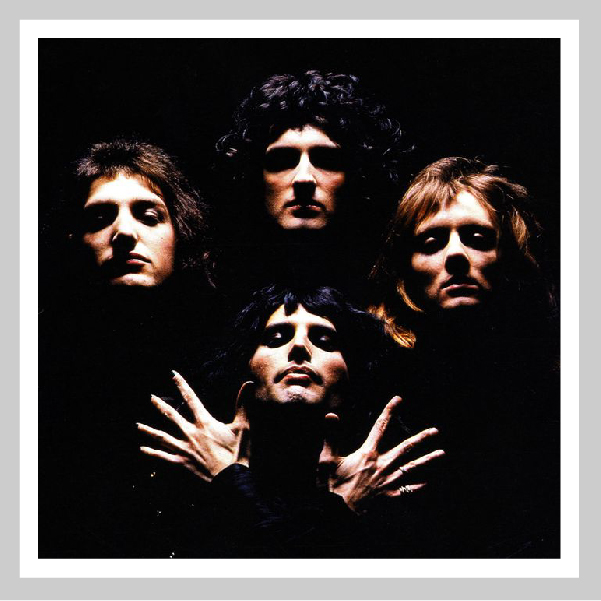
Artist: Queen
Album: Queen II
Photographer: Mick Rock
Everybody will remember the video for Bohemiam Rhapsody, but it is this photograph by Mick Rock taken a year earlier that made the band iconic. They initially thought the shot too pretentious, but Rock persuaded them to go with it – “It made them look like much bigger a deal then they were at the time, but it was a true reflection of their music”.
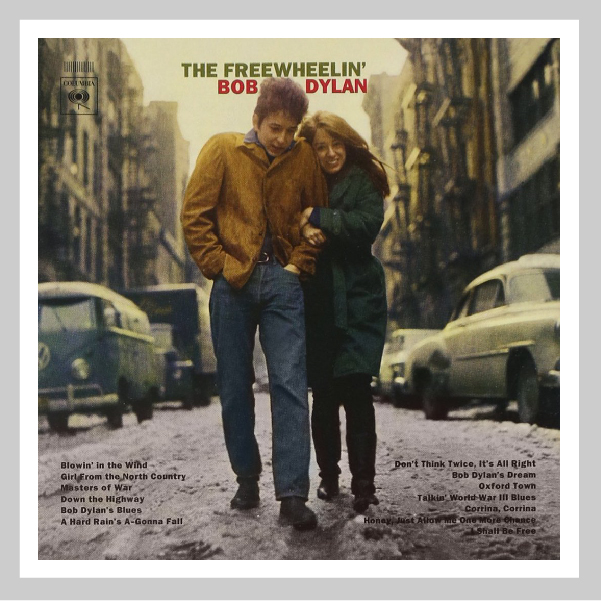
Artist: Bob Dylan
Album: The Freewheelin’ Bob Dylan
Photographer: Don Hunstein
You often hear the phrase ‘less is more’ spoken but so rarely used, this album cover does and is all the cooler for it. This casual photograph of Dylan with his then-muse Suze Rotolo, taken in the West Village, New York City, was unusual at the time for being unstaged and unposed and it reflects the music created by legend. Photography was a key component in developing a clear and distinctive brand for our client St Ives. Choosing a photographer and selecting the right environment for the subject matter allowed us to capture the essence of what it is to be a child in a school they love.
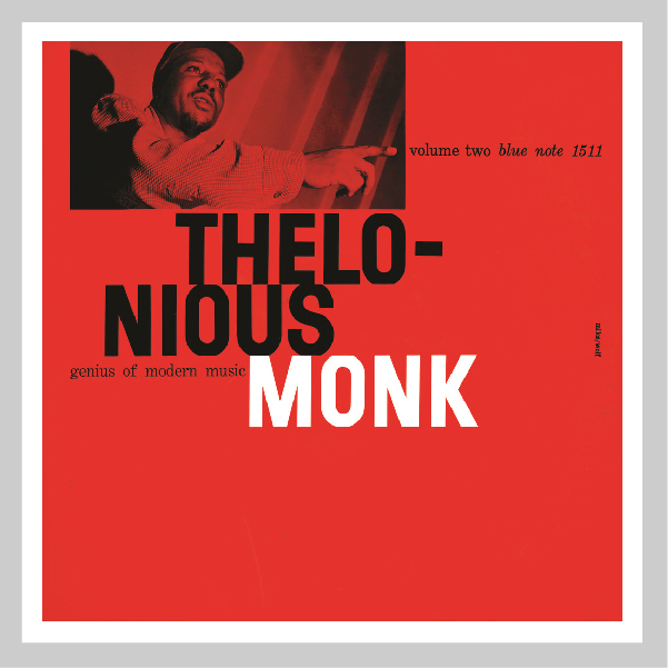
Artist: Thelonious Monk
Album: Genius of Modern Music, Vol. 2
Designer: Reid Miles, Photo: Francis Wolff
There are so many jazz albums that I love. But those produced for the Blue Note label particularly stand out. It’s the combination of atmospheric photography, brilliantly bold typography and the limited colour palette which make these covers really stand out. The duotone colour palette was in part down to a forced design aesthetic – Printing two colours was far cheaper than a full four colour photographic cover. What a great example of how budget limitations can actually improve the creative outcome.
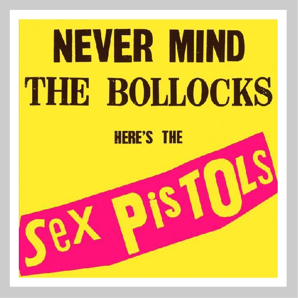
Artist: The Sex Pistols
Album: Never Mind The Bollocks
Designer: Jamie Reed
Reed never wanted to put the band on the cover and was quoted saying “the band were ugly anyway”. Instead, he used the punk aesthetic that the band were renowned for to create this unforgettable album cover. Iconic and totally punk!
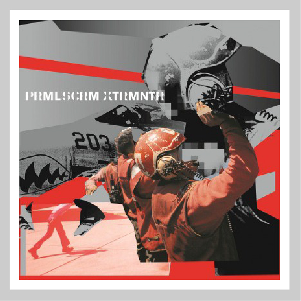
Artist: Primal Scream
Album: Exterminator
Designer: Julian House
Julian House at Intro produced this award-winning campaign using a combination of powerful imagery, bold colour palette and bespoke typography. The results are edgy, engaging and totally reflective of the music.
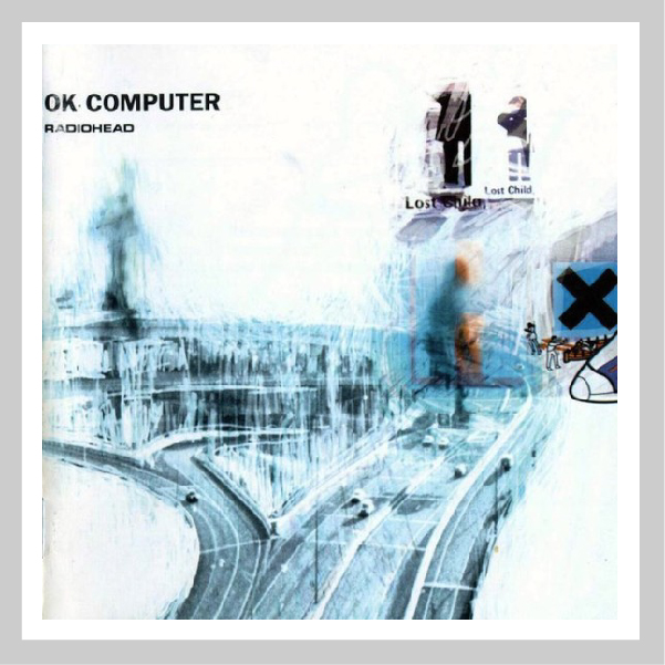
Artist: Radiohead
Album: OK Computer
Designer: Stanley Donwood
This has significant meaning for me as it was the first piece of graphic design that really grabbed me. I loved the layering and erasing of layers to reveal this ethereal composition.
Stanley Donwood has worked with the band second album ‘The Bends’ and describes the relationship he has with the band as “harmonious.” He starts working with them very early on in the recording process and develops the artwork over most of the time it takes for the record to be made. Read more on the NME site.
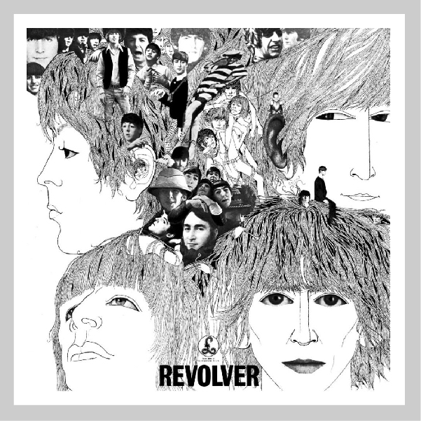
Artist: The Beatles
Album: Revolver
Designer: Klaus Voormann
Voormann’s spacey collage of drawings and photos complemented songs that reflected the Beatles’ LSD experiments during its production. Listen to the album whilst looking at this album cover and it all makes perfect sense!
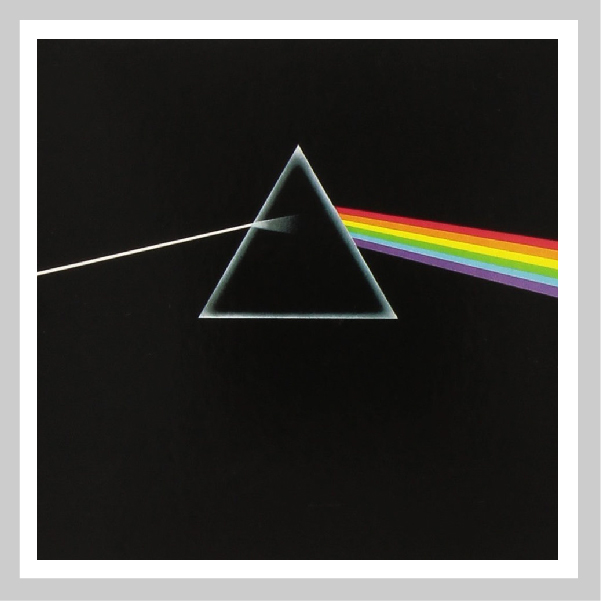
Artist: Pink Floyd
Album: Dark Side of the Moon
Designer: Storm Thorgerson
Using inspiration from Floyd’s live light show and a triangle, a symbol of thought and ambition, Thorgeson created this cover and a piece of musical and art history. Incredibly powerful and instantly recognisable, the omission of any typography gives even greater impact and surprisingly greater recognition for the band. Another great example of ‘Less is more’.
To conclude now, I can hear the howls of discontent – What about Abbey Road, London Calling, The Ramones and The Velvet Underground & Nico? Yes, they are all great covers and there are many more but as I mentioned at the beginning, this is not a definitive list, nor is it my top ten. They are just great pieces of design that border on being true pieces of art, but that is a discussion for another time. For now, I will enjoy looking at the covers, reminiscing about the time I first saw them and continue to enjoy listening to the music as I search my fruit based listening device for the latest chart topper and hope I find a new favourite to add to the list.
What will be in your top ten?
Bob
Can we help you with a project?
Address
Mzuri Design Limited
Wolfe Mead
Farnham Road
Bordon
Hampshire
GU35 0NH
Contact
+44 (0)1428 722990
hello@mzuri.co.uk
Newsletter
Your email address
Thank you