
Designed to Inspire: Logos – Clear, Simple, Distinctive.
JANUARY 22, 2018
Here are some of the very best logos (and brands) that have been created over the past 80 years. Managing to reduce the number down to just five was an impossibility, but I did manage six, well seven if you include the recent ENO refresh. No, it’s 9 in fact, as three versions of the Penguin logo all deserve a mention. I am pleased to say there are many more and it has been a joy to explore new work alongside revisiting some classics.
So what does make a good logo?
Very simply, there are three main principles; Clear, Simple, Distinctive.
Alongside these key principles, you can throw a few other adjectives into the mix; timeless, versatile and appropriate. I hope, when you look over the shortlist selected, you will see why they have been chosen and how effortlessly they fulfil each of these criteria. Whilst reviewing them, I found myself in awe of the sheer brilliance of their simplicity whilst trying to temper my increasing jealousy.
What I love about all of these logos is that you can easily be forgiven for thinking that you could have created them yourself. They are so simple, you could even question whether they have actually been ‘designed’. Instead they have just come into creation with a simple flick of a switch or tap on a keyboard.
For those of you who have ever tried to create a logo, you will know, that is not the case. Whilst appearing ever so simple, the skill behind creating them comes from years of experience and refinement of ones craft. Not only are these unique marks, they are exceptional mark makers. I believe Malcom Gladwells’ 10,000 hour rule falls a little short of these true masters. For any budding young designer out there wanting to make a mark for themselves, remember, it is not only the quantity of hours spent but the quality of that time.
Exceptional logo designs
The time spent agonising over what order to put them in was a little less, and after some deliberation, I have opted for a diplomatic alphabetical listing. I simply could not decide as they all have their own unique and distinct qualities. Whilst writing the article, one hour Mike Dempsey would top the list, only to be surpassed by Alan Fletcher a couple of hours later.
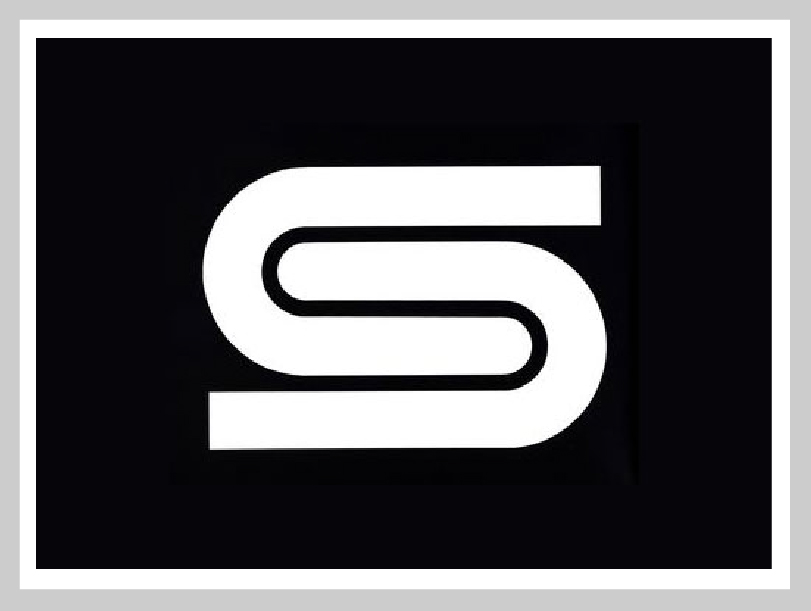
British Steel – David Gentleman, 1969
Clear, Simple, Distinctive. TICK, TICK, TICK!
What is so great about this logo is it absolute appropriateness for the company it represents. Strong yet malleable, sharp and smooth, the combining of two elements to create one strong form. In the logo design book TM, written by Creative Review’s Mark Sinclair, Gentleman said of his logo: “I wanted to do a monochrome symbol that would work with type and in a wide variety of circumstances… and it had to be simple and economical.”
Enough said.
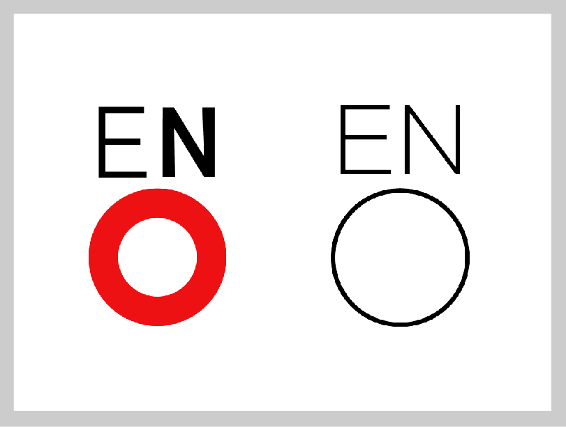
ENO – Mike Dempsey, 1991
I am including both Dempsey’s original and the refreshed version by Design studio Rose as they are both beautiful pieces of typography. The simplicity of the letterforms and positioning to forma rudimentary face is brilliant. I must admit, I prefer, the slight quirkiness of Dempsey’s original with a fuller formed ‘O’ and use of red to give a nod to a woman’s full lips, reminiscent of the opera legend Maria Callas.
Read a more in depth review of the rebrand in Design Week article ‘English National Opera rebrands to become “more accessible”’.
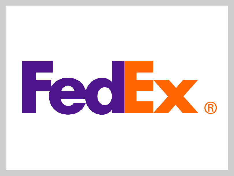
FedEx – Lindon Leader, 1994
The FedEx logo is legendary among designers and I always find it a source of inspiration when exploring a new identity for a brand. I have often used it to explain positive and negative space with clients and is always a source of joy when you see someone ‘not in the know’ discover the hidden arrow. If you haven’t spotted it, then I urge you to carry on looking. I guarantee when you find it, you will tell the next person you meet. Read a fascinating article by Matthew May about ‘The Story Behind The Famous FedEx Logo, And Why It Works’.
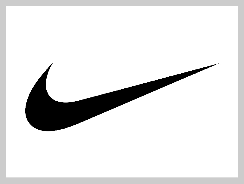
Nike – Carolyn Davidson, 1971
One of the most recognizable logos in the world. What’s great about the story is that it wasn’t created by a big advertising or branding company, instead it was designed by graphic designer Carolyn Davidson in 1971. Her invoice total for this important piece of design history… $35. You can’t put a price on true creativity! Read this article by Creative Market for some greater insight.
Over 35 years on and the ‘swoosh’ is still as striking (and appropriate) as ever. Its use of a sweeping curve reminiscent of a running track and the dynamism of an elite athlete. The upward trajectory symbolising positivity and the pursuit of greatness. Used in positive or negative space, apply any colour, pattern or image to it and it remains instantly recognisable. Ask any child to draw a sports brand and I guarantee you’ll get this tick.
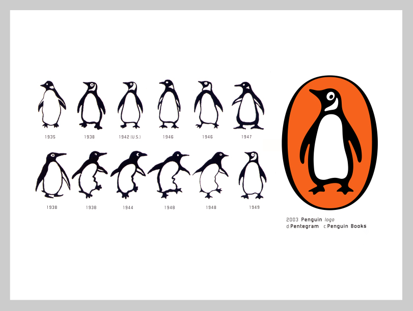
Penguin Books – Edward Young (1935), Jan Tscichold (1949), Angus Hyland (2003)
“It was the obvious answer, a stroke of genius,” said Penguin’s original designer, Edward Young. “I went straight off to the zoo to spend the rest of the day drawing penguins in every pose.” – from an article in The Guardian.
What better way to capture the ‘dignified but flippant’ nature of a penguin. Sometimes, as designers, we remove ourselves from the original source in order to create something more refined, more abstract, more iconic. Sometimes this can work in ones favour, but I believe Youngs’ process of visiting the source material and drawing inspiration directly from it, created something unique and timeless. This quirky little penguin will be familiar and much loved by thousands, much like the infamous Toucan from the Guinness adverts. See my article on poster design for more insight. We must also salute designers Jan Tscichold and Angus Hyland for their sympathetic refreshes of the brand. To often, we see logo refreshes or rebrands that lose the energy and essence of the original brand. Thankfully, nothing has been lost of the refinement of this cheeky little flightless bird.
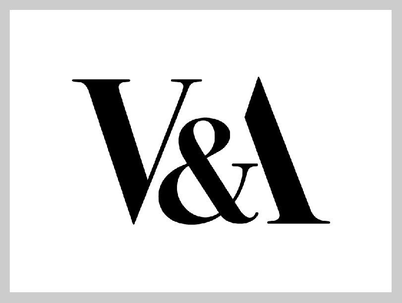
V&A – Alan Fletcher, 1989
Over the years, my love of typography has grown and become more refined. There is one piece of typography, however, which I have admired ever since I started looking at letterforms. This wonderful example shows Fletcher’s knowledge and experience of handling type. Set in Bodoni, it brings the three letters of the museum’s nickname, V&A, together as a unified symbol. Removing half the letter ‘A’ and then using an ampersand to reinstate the missing crossbar is a stroke of understated genius. The resulting mark is beautiful and elegant.
Creating a truly memorable and iconic brand is not an easy task which is why so many companies come and go leaving very little to remember them by. So stop and reflect upon these examples and marvel in their timeless simplicity. Twenty, thirty, even seventy years on and they still look as strong and vibrant as any created yesterday. But like anything that lasts a long time, they are built on strong foundations. We pride ourselves on creating strong and distinctive brands for our clients that will stand the test of time, take a look at some of our work and see if you agree.
If you are interested in discovering more outstanding logo design and want a fantastic book that showcases the very best of this art form (including some of those mentioned above), then I urge you to get TM: The Untold Stories Behind 29 Classic Logos by Mark Sinclair. A fantastic book with some fabulous brands.
What’s your favourite?
Bob
Can we help you with a project?
Address
Mzuri Design Limited
Wolfe Mead
Farnham Road
Bordon
Hampshire
GU35 0NH
Contact
+44 (0)1428 722990
hello@mzuri.co.uk
Newsletter
Your email address
Thank you