Designed to Inspire: The purpose of a poster
NOVEMBER 13, 2018
What is the purpose of a poster? To promote, protest, inspire, harass…
What is it that makes a poster more than just an advert? Poster design is a field where artists and designers can express their creativity in an entirely unique format. Similar to album artwork, a poster can often cross that fine line between art and design. The truly great posters, break free the constraints of the printed canvas, transcending their original function and go on to lead a life of their own.
Sadly, a lot of posters fall very short, neither functioning as a useful piece of graphic design or bringing joy, through sheer aesthetic pleasure. I won’t share any examples of these, as walk down any high street or stand on any train platform and you will see them all around. Actually, you won’t. They will just be lost in all the noise and banality of media trash that causes us to look down and stare blankly into our shiny mobile devices for some form of escape.
Instead, lets look at some truly eye-catching and iconic image making. These true creatives have experimented with illustration, typography, negative space and more to produce something that I believe is truly inspiring, and failing that, just beautiful to look at.
The original image that inspired me to write this article, I first discovered whilst at Art College and I still see it 20 years on as a truly inspirational piece of design. This is a perfect example of form and function by Fritz Schleifer. The ‘Bauhaus Ausstellung’ Exhibition poster in 1923 uses simple geometric forms, a refined colour palette and concise typography that come together to form this unique image that I wish we saw more of.
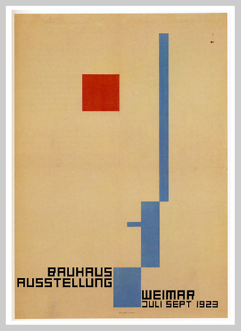
To find out more about Bauhaus design, visit bauhaus-movement website.
Following this theme, this contemporary film poster by Olly Moss uses paired back form, simple, refined typography and a bold colour palette. The beautiful use of negative space recreates two iconic figures that are instantly recognisable. See more of Olly’s work at here.
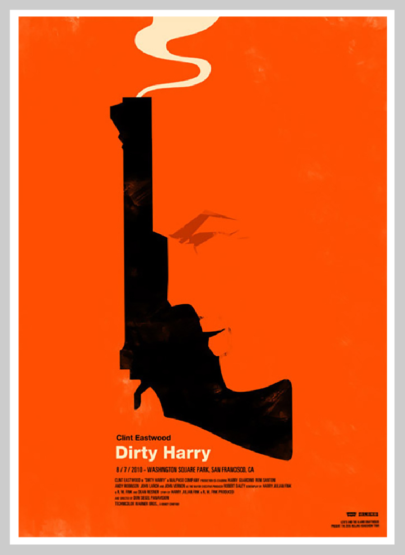
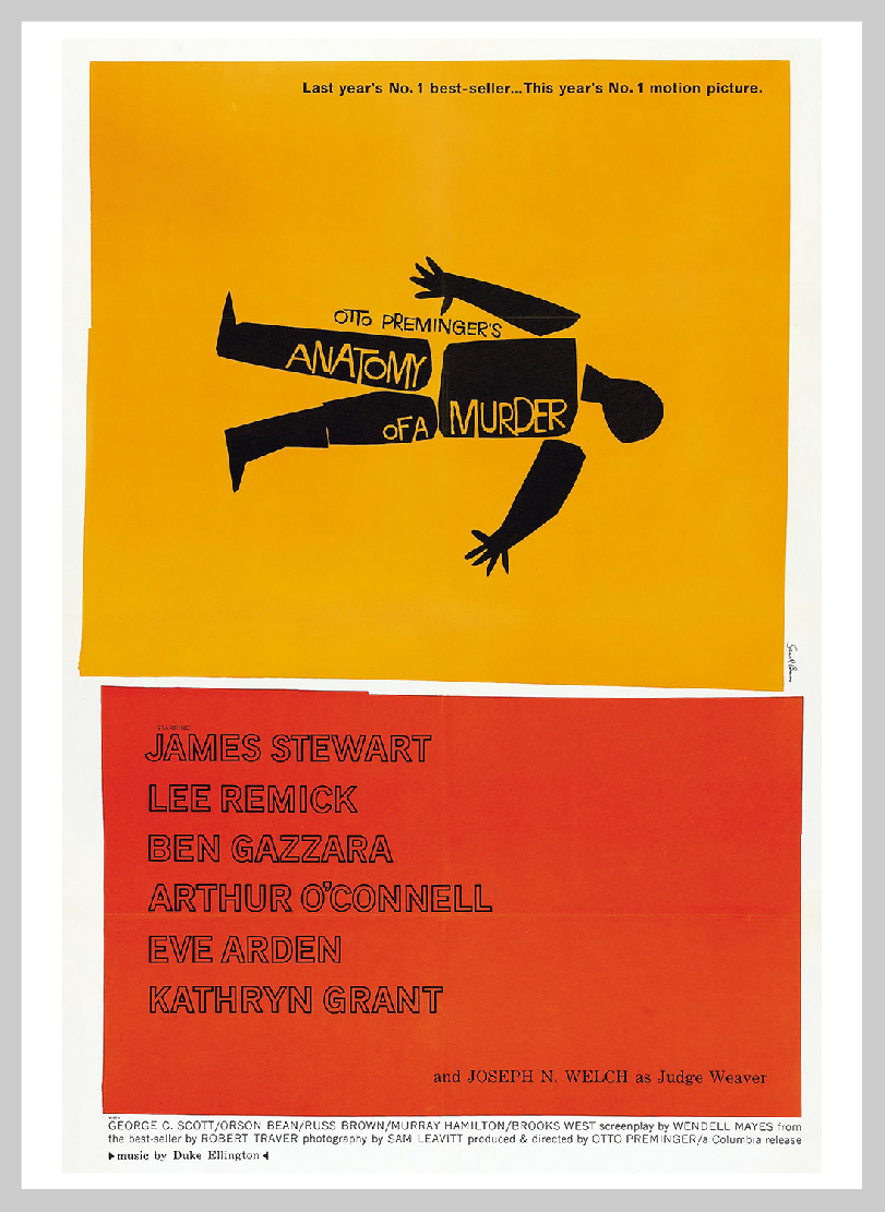
I would not be surprised if Olly took some form of inspiration from legendary designer Saul Bass. Famous for his collaboration with Alfred Hitchcock, producing title sequences for his films, alongside promotional posters, his use of simple forms and bold use of colour convey a message unique to each film. Take a look at some great examples of ground-breaking title sequences for some iconic films.
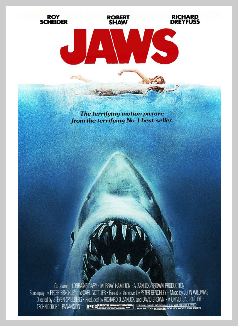
Following the movie scene, who can forget the life changing effect this poster has had on a small boy visiting the beach. The artist credited with creating the ‘Jaws’ image was Roger Kastel. What I love is its flagrant disregard for scale and proportion. It doesn’t matter, the artist is trying to evoke and emotional response which ties in beautifully with the suspense you feel whilst watching the film. You know its coming and you are helpless to do anything about it… Don’t go into the water this summer! If you are interested, read this article about how it came about.
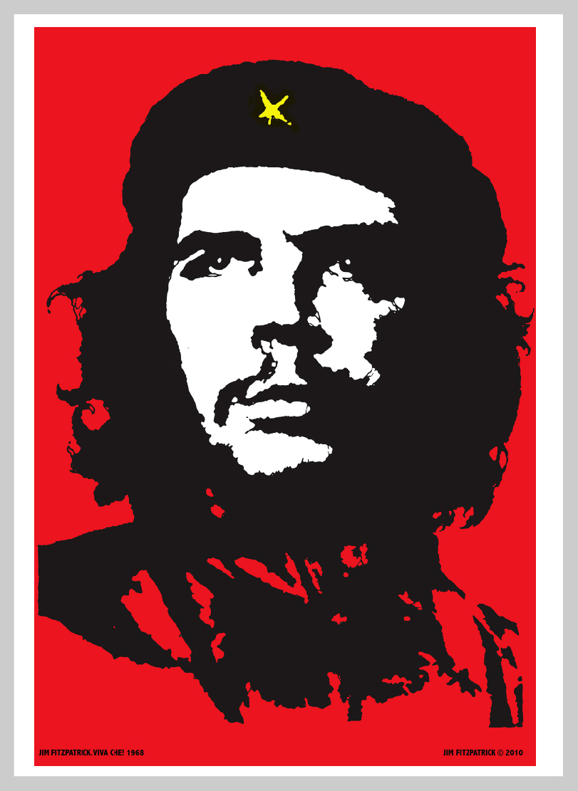
In 1967, Irish artist Jim Fitzpatrick used Alberto Korda’s iconic photograph of Che Guevara as a basis for creating his own stylized poster. This political poster truly has transcended its original use and is now instantly recognised around the world as a symbol of revolution. Whether you agree with the original politics behind it or those who have adopted it, you have to admire its brutal simplicity.
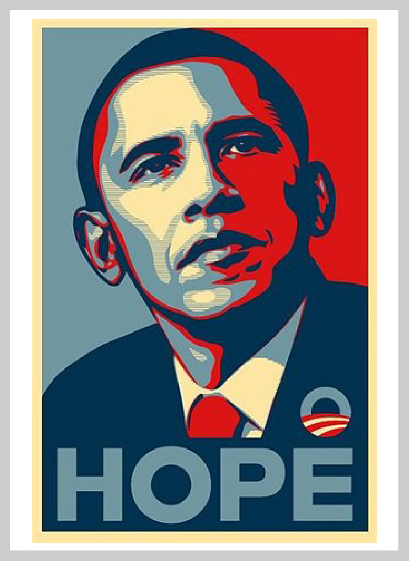
Move on 40 years and we see a another graphic representation of another iconic leader and symbol of change, Barack Obama. Shepard Fairey, originally known for his ‘Andre the Giant’ guerrilla sticker campaigns created this now-iconic ‘Hope’ poster of then-Senator Obama. This political poster shares more than one similarity to the Che Guevara image – A strong colour palette, bold forms and powerful message. See what else Shepard has been up to at obey.
From one Icon to another, Guinness has been synonymous for producing outstanding ad campaigns. I think most people will remember their ‘Surfer’ TV ad . But it is their earlier printed campaigns that stand out as genuinely iconic. Find out more about how the Toucan came about here. I will just sit back and smile (as I do every time) when I look at this wonderfully original poster. The concept came from advertising agency of S.H.Benson back in 1935 using, among others, the Toucan illustration (below) by John Gilroy as one of many produced to promote Guinness for almost 50 years until 1982. Thankfully, they still produce wonderfully creative, sometimes off the wall, adverts which is a testament to both the company and the agencies they employ.
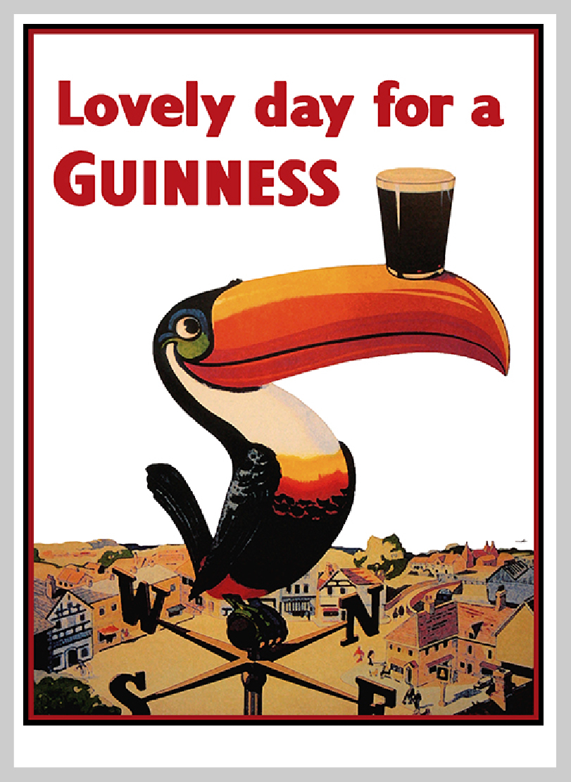
And what better place to stop. If you can’t look at a poster and have an immediate emotional reaction, whether it be one of joy, sadness, hysteria or anger, then I don’t see the point of its initial creation. I will look on these examples of original creativity from designers and artist with true talent, skill and passion and look to push myself to create designs that are equally meaningful, memorable and hopefully inspirational.
Now though, it is a ‘Lovely day for a Guinness’.
Bob
Can we help you with a project?

 © 2025 Mzuri Design Limited. Registered in England and Wales. Company No. 08451702 |