
Logos and Fonts – What do yours say about you?
FEBRUARY 13, 2019
Given the plethora of recently redesigned logos, you could be forgiven for thinking that the only differentiating factor between current typographic trends is the choice of upper or lower case. But surely there’s more to these current design decisions than meets the eye? Here we take a look at the current design trends and how you can use this insight to help inform your choice of font to represent your brand identity.
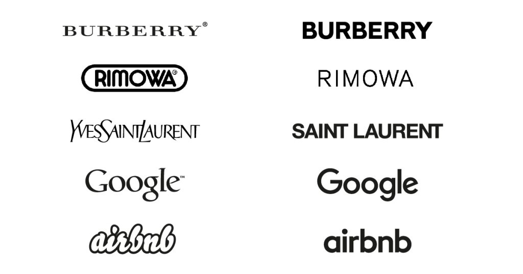
So why the sudden need for conformity? Looking at the examples above, you can see that the fashion and technology sectors are both keeping true to their heritage and keeping either upper or lower case, but all have opted for very similar Sans Serif fonts.
These are industries synonymous with creativity and innovation and most people would expect that they would be pushing for something a little more unique, or even disruptive. Is there a reason why brands are moving away from a recognisable logo or icon and opting for something purely typographic?
Taking a closer look
Typographic logos are complicated entities. They can communicate trust or uncertainty, make you look knowledgeable or clueless, and come across as expensive or cheap. Our associations with different typography triggers powerful thoughts, emotions and ideas.
For companies, choosing the right typography in a logo design is vital in delivering the gaps in their brand personality.
So how do you select a font that gives the right impression? One of the easiest ways is to start looking at your existing audience and creating a user persona. Steve Harvey of Fabrikbrands identifies that user personas “… enhance customer experiences in a structured way, which results in more effective sales and marketing output. Research tells us that user personas make websites anywhere between 2 and 5 times more effective for users, and result in a 100% increase in page visits! The only problem is, 85% of businesses don’t make the most of their user personas.”
It’s vital that we identify our audience and primary users of our brand. It’s also important to remember that our audience is continually evolving and (hopefully) growing. As our customer base grows, so should our brand alongside it. This is what we see with regards to the current logo trends of some of the big brands from the niche logos of a start-up business into a fully formed multi-national organisation. No longer do we see a logo as a visual representation of its personality, instead it symbolises the entire experience the user has with the organisation.
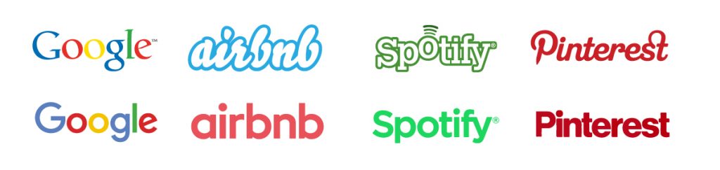
Ryannee on twitter writes: ‘Apart from having similar typefaces in their logos (Google, Airbnb, Spotify, Pinterest), the brands feel completely different. They make totally different products, have different personalities, different audiences, business models, etc.’
The other reason for this current design shift has to do with the way in which we use and interact with a brand. No longer are we constrained to seeing adverts in magazines or billboards. Gone are the days of commercials being limited to the TV or cinema. All are now are accessible in the palm of your hand and at any time, day or night. So these logos need to work harder than ever before, in large format on the side of buildings all the way down to the App icon on your smart device so simplicity is key.
A needle in a pile of needles
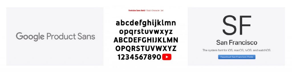
So how can we select a typeface that really represents the brand and appeals to the user persona? There are literally hundreds of thousands of fonts available for you to choose from a variety of different sources including free websites to bespoke font foundries.
A good starting point is Google’s own online font resource, featuring over 900 font families (typefaces), some having up to 18 different fonts (meaning the specific feature such as bold or italic) within a particular family. If we took an average, that’s potentially over 8,000 individual fonts to choose from one website. Therefore, there is a great opportunity to choose an individual font for your brand, but remember, a good typeface can engage your audience—while a bad one can drive them away. And, believe me, there are many bad fonts within those 8,000 that will be entirely inappropriate and indeed turn a user away before they even become a customer.
Choosing one from the thousands is a difficult task, and the big brands are overcoming this challenge byt taking an alternative route, they are creating bespoke typefaces that work to build a more unified and cohesive brand identity. These bespoke typefaces also serve a secondary purpose, to save their client thousands if not millions of pounds each year. Miriam Harris from Digital Arts online states: ‘digital brands aren’t just choosing a custom typeface for brand aesthetics and ownership – it’s also a smart move to save millions every year on font licensing’.
Making the right choice
Even before your customer reads the message in your marketing, the font is already communicating to them. Every font delivers a different message, each having different strengths and weaknesses. Using your research into personas, identify which font type best matches your user.
We have worked on a number of brand identities that required careful investigation into typography and font selection. Following marketing workshops with the onlyFE team, we identified a need to invigorate their brand, this incorporated a vibrant colour palette and clever font combinations that gave the brand a unique identity. Our use of a robust Sans Serif in our logo and brand work for RM Construction shows how we identified the contrasting personas of each company and subsequently each brand has a clear and distinct personality.
Choosing the right font can be difficult but finding the font that will speak for you brand, giving it a unique voice whilst maintaining clarity can be massively rewarding both personally and commercially. The most important rule is choose fonts that are legible and clear, that won’t tire the eyes after extended reading. Choose fonts that seem timeless, classic and cohesive, working across all platforms and devices.
Once you have your chosen font, it’s important to maintain consistency. Creating a style guide to make sure your company’s marketing and messaging remain clear and consistent will help, not only with the tone of voice but also the visual aesthetic. Your font choice is incredibly important but is still only one part of your whole identity. Colour, imagery, iconography, messaging are all equally important in forming a strong and unique brand.
If you need help or would like to discuss a new brand identity or your latest branding or typographic challenge, get in contact with one of our team.
Can we help you with a project?
Address
Mzuri Design Limited
Wolfe Mead
Farnham Road
Bordon
Hampshire
GU35 0NH
Contact
+44 (0)1428 722990
hello@mzuri.co.uk
Newsletter
Your email address
Thank you