
Take inspiration from the latest design trends.
JUNE 21, 2019
We’re already halfway through 2019 and we’ve been keeping our eyes peeled on all the latest trends in the design world.
This year, there seems to be a lot of focus on breaking the norm and reverting to styles which shouldn’t work together, but interestingly they do.
We’ve taken a look at some of our favourites so far this year, why not take a look and see if these styles can inspire and help inform your brand style…
1. Simplicity
Simple designs have been on the rise for some years now and with more of us living our lives on websites and apps this is only accelerating.
“Consumers are now used to seeing a flatter, cleaner, uncluttered design aesthetic in the apps and sites they use,” says Alastair Holmes, associate creative director at This Place. “So it makes sense that companies should want to reflect this in their overall branding.”
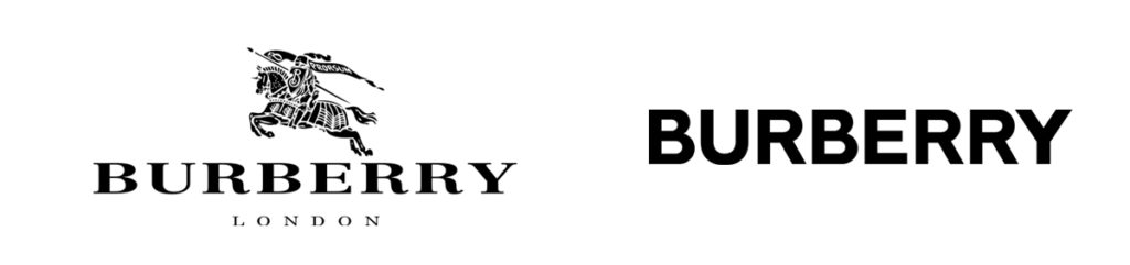
One great example of a well-established brand simplifying their identity is Burberry. They have removed their knight on horseback to focus on the name of the brand and its typography. A sans-serif font gives a graphic approach which calls to their iconic check pattern and gives more prominence to the name rather than the knight.
2. Duotones and Colour Gradients
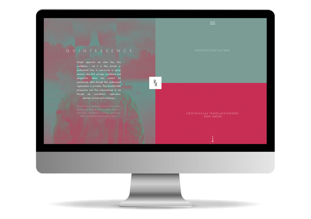
Duotones made a huge comeback last year and the trend started with Spotify’s iconic playlist covers but has continued to evolve. Along with other brands like Apple with the iPhone X and Instagram (Boomerang and layout included) developers are now able to code gradients on websites, rather than manually make graphics for them. The simplicity and ease in which this can be done now has seen the application of colour gradients increase on websites, and become a growing trend in the digital world. An example where this approach has been applied can be seen on the Renate Rechner website. They have used this approach as well as a unique navigation to take their site to a new level.
3. Custom Fonts.
As more and more brands are starting to rely on strong typography for their logo, it is also becoming harder to differentiate from competitors. To achieve this, brands are now starting to develop their own fonts to deliver a look and feel which is representative of their ethos.
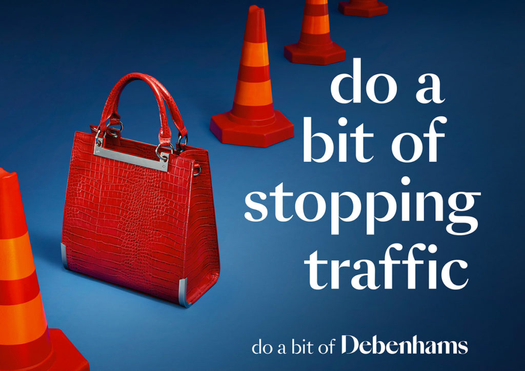
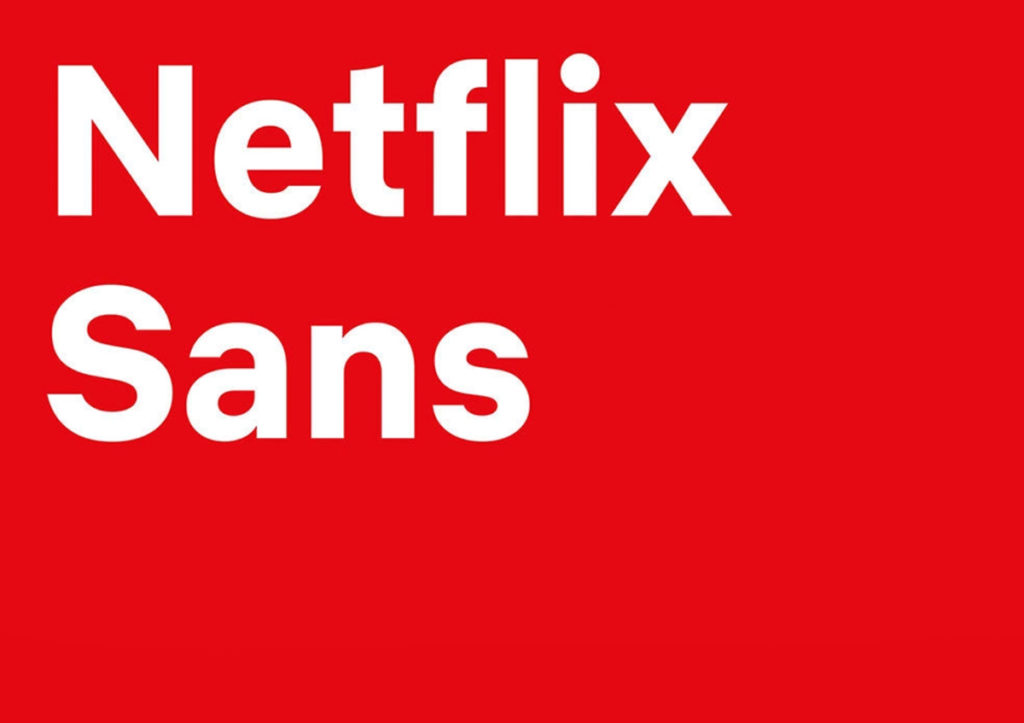
Debenhams introduced its own custom typeface in 2018 as seen below, and Netflix created a more ‘ownable’ font, that was clean, neutral and representative of the brands aesthetics.
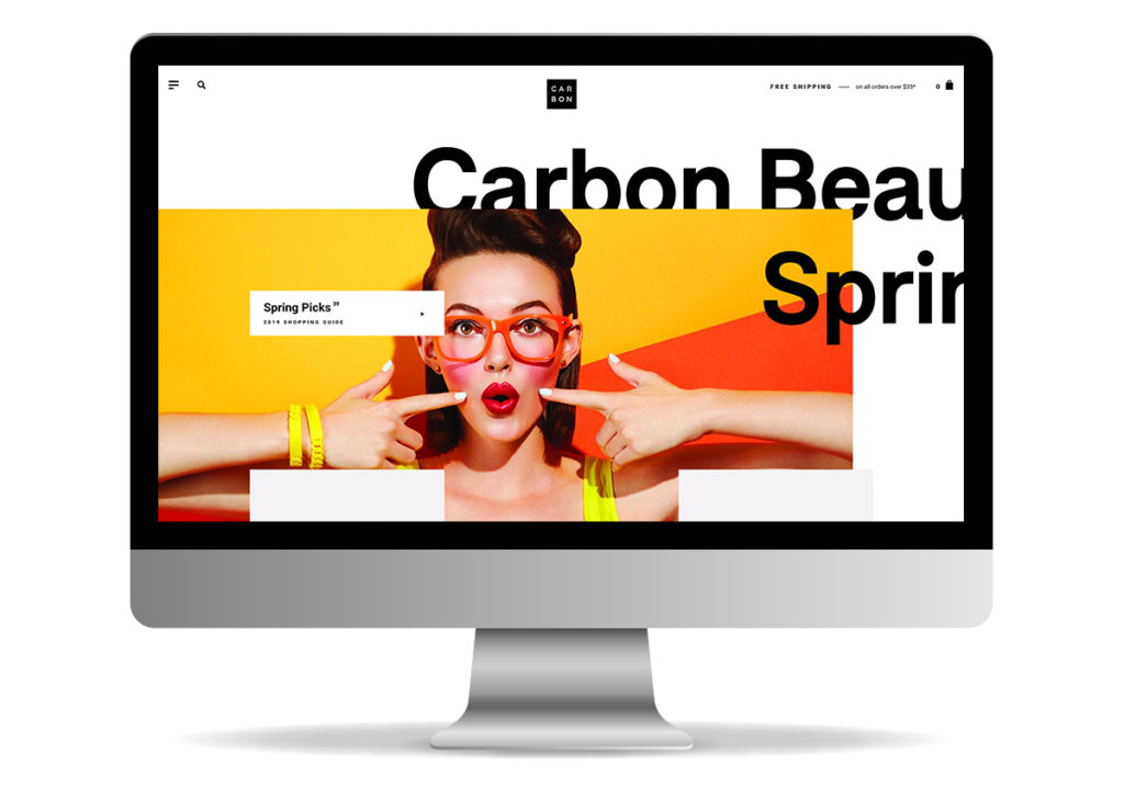
4. Breaking the Grid
Symmetry is safe and aesthetically pleasing, but also rather overused and not distinct, bespoke or alive. Designers are starting to break away from the rigid and predictable grid with ‘asymmetrical balance’, which can make things more interesting, add more kinetic energy and movement within designs. This approach creates an interest to the user, especially in web design as they scroll curiously to see where the information and graphical elements may take them next.
This approach can be seen in the example below, where text and imagery elements overlap and engage with each other on the Carbon Beauty website.
Design trends evolve year in and year out, which helps us to keep our creative juices flowing and inspiration building. Whether you’re working with a designer or considering a refresh to your existing brand identity it’s important to keep up to date with the latest trends and see if they can help inform your style.
For brand development or a design review of your brand identity, get in touch and see how we can help you with your business requirements.
Can we help you with a project?
Address
Mzuri Design Limited
Wolfe Mead
Farnham Road
Bordon
Hampshire
GU35 0NH
Contact
+44 (0)1428 722990
hello@mzuri.co.uk
Newsletter
Your email address
Thank you