Rebranding, design, marketing and a new website

Oak Lodge Dental

SERVICES

BRAND IDENTITY & DESIGN
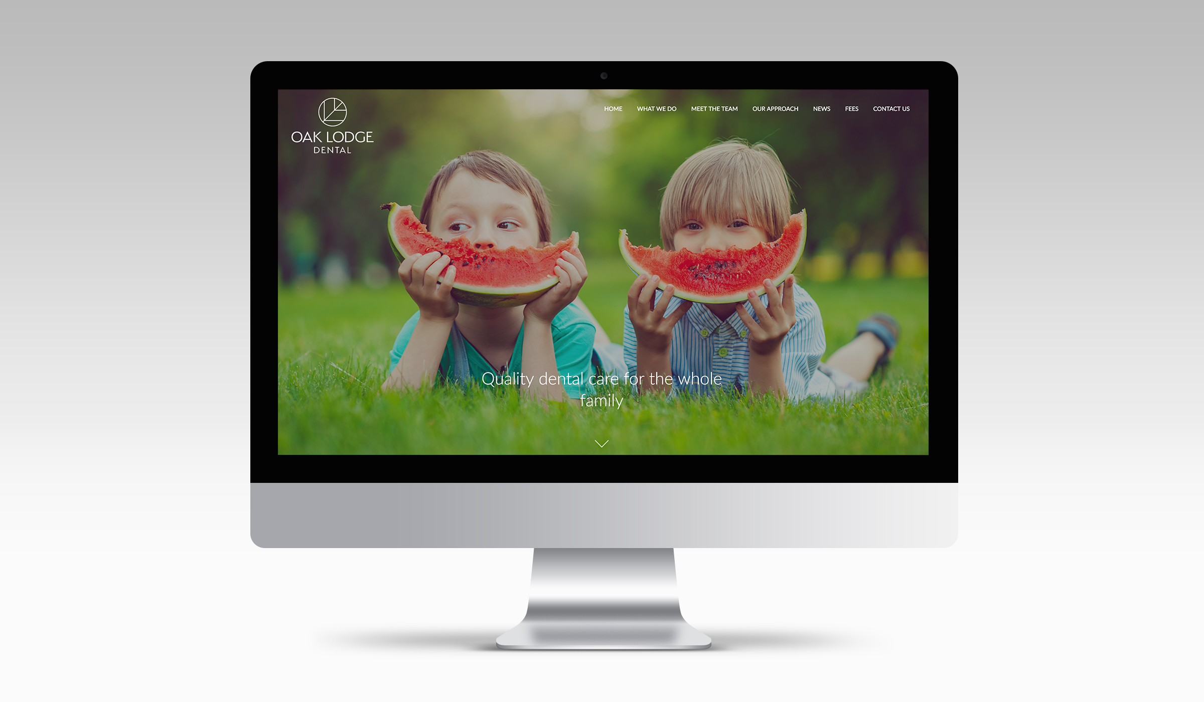
DIGITAL
PRINT

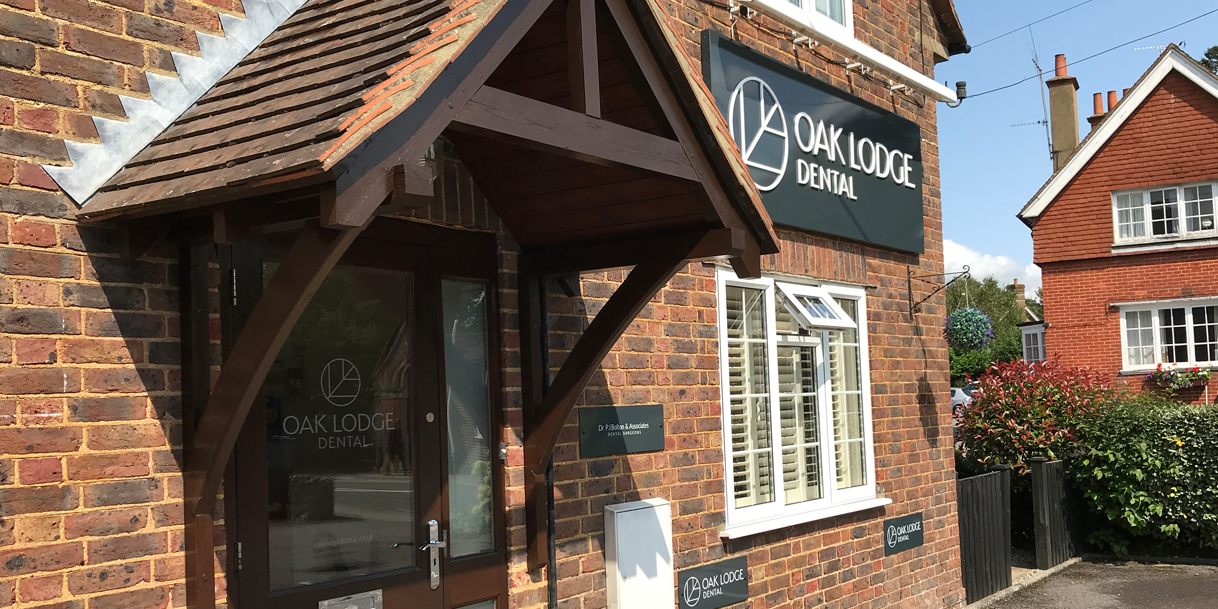
Oak Lodge Dental is a family-run, private dental practice located in the centre of Liphook, Hampshire, founded almost 30 years ago. We have worked with the team since 2004, to support them across marketing, design and digital projects.

A thriving practice dedicated to providing the highest level of care for their patients, Oak Lodge not only attracts local patients from Liphook, Haslemere and the surrounding area, but also has a loyal patient base who continue to visit the practice from as far afield as London, Amsterdam and even Florida!

With their forward-thinking ethos at the heart of everything they do, Oak Lodge recently engaged us to rebrand their practice to better reflect the modern premises and ongoing evolution as a centre of dental excellence for the whole family.

www.oaklodgedental.co.uk

Having worked on the original Oak Lodge brand identity back in 2004 and seen the practice evolve over that time, we were delighted to have the opportunity to take a fresh look at the logo and roll out as the practice approached its 30th birthday.

We set about developing the new brand, working with the team through several iterations and developing the chosen concept. Central to our branding process was the desire to modernise and retain the connection between the logo device and the renowned Oak Lodge name. When thinking about dentistry, words such as clean, symmetrical and precision come to mind which helped us to define our approach.

The new Oak Lodge Dental logo is a contemporary evolution of the recognisable oak leaf, using fine lines and a symmetrical approach to encompass the brand values.

Hand in hand with the logo development we looked at the development of a new colour palette; dental practices are often drawn to traditional blue and green colour palettes and we wanted to ensure the Oak Lodge redesign was recognisable but importantly stood out amongst the crowd.

Taking inspiration from the stylish interior colour schemes created by Farrow & Ball, we developed a soft, inviting and premium palette of colours to be used across the communication platforms, combined with a punchy modern grey.

A new website formed a key part of the re-branding project. In developing the content for the site, we had to strike the right balance between inclusion of appropriate dental terminology, with the need to be contemporary, concise and engaging - and of course jargon free!

The new Oak Lodge Dental website was designed to inspire those of us needing a nudge when it comes to our dental health, and to provide existing patients with clear and concise information on services and general dental health.

The news page on the new website forms the baseline of their communication strategy with new and prospective patients, offering oral hygiene advice, treatment information and practice news.

All touchpoints had to be considered as part of the re-brand, so we developed a project plan and have evolved the patient communications to the new brand, including, for instance, business stationery, welcome pack, practice signage, advertising and social media.

We were thrilled to work with Oak Lodge on this exciting project. Alongside the brand development work, we continue to support the practice across all of their marketing, design and digital needs, working with them on a monthly basis to develop and deliver their marketing strategy.

The team at Oak Lodge are thrilled with the results and initial patient feedback is very positive too. Office Manager, Emma Coomber, had this to say:

'I love it so much!!! I'm so happy we've got such a modern, fresh looking website that finally properly reflects who we are and what we do. And stands out from the oceans of boring, generic dental websites. You've made my year guys!'

Can we help you with a project?