
An engaging identity for a specialist family law practice
JULY 16, 2018
Working with Edward Cooke Family Law has been an incredibly enjoyable and enlightening experience. We first met Edward back in April 2018 and since then have enjoyed every encounter, learning a little more about the man who provides an incredibly valuable service in a particularly challenging field.
The initial brief was to create a typographic logo to present Edward Cooke Family Law as an experienced and professional, yet friendly and approachable firm. It was important that the look and feel was not too serious, stiff, corporate or daunting and for us to create a brand that not only represented Edward, but also embodied the work he does.
A child centered approach
We worked very closely with Edward over several months to realise his vision, creating a unique mark based on speech marks depicting a family with the child at the centre – demonstrating that each family member has their own perspective and point of view.
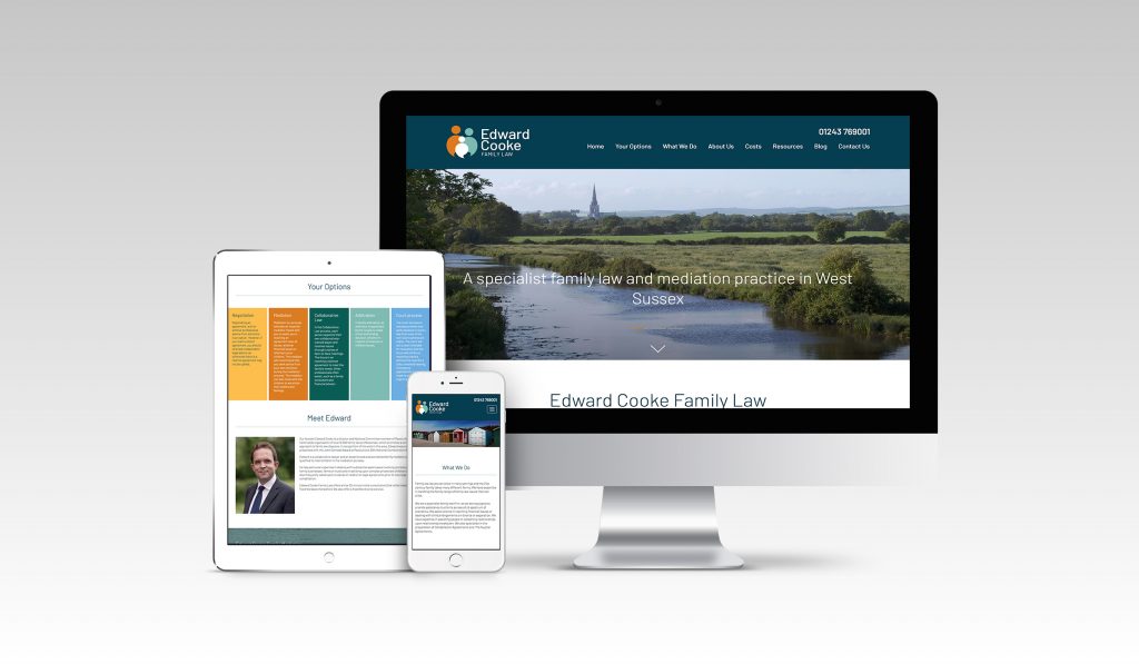
Taking the lead from the logo, we built the brand around it, developing a harmonious colour palette that reflected the professional yet sensitive nature of the work Edward does. The website has been designed with adults and children facing a difficult period in life front of mind; simplicity and ease of navigation were key. Also, a dedicated children’s section of the website provides access to resources specifically for children. The modern colour palette and local photography ensure a soft and friendly feel that encourages visitors to explore the options available to them.
The new branding has been very well received by all and we’re thrilled with the results. The identity has been applied to the full spectrum of branded material including stationery, signage, a direct mailer and of course their new website.
Find more about the work we did for them in our case study.
Can we help you with a project?
Address
Mzuri Design Limited
Wolfe Mead
Farnham Road
Bordon
Hampshire
GU35 0NH
Contact
+44 (0)1428 722990
hello@mzuri.co.uk
Newsletter
Your email address
Thank you