
Designed to Inspire: Design Classics
FEBRUARY 12, 2018
It takes time to become a classic. Classics can’t be invented, they evolve. They have to win approval and slowly acquire value. Resisting the inevitable ebb and flow of taste and fashion, I have selected six designs, to share with you and discuss their merits. These objects still look (and function) as good as they did the day they were created.
Why have I chosen these six objects? For the simple reason (with the exception of one) that I have wanted to own one since the first time I saw one… and still do! Three are in my possession, one has been and gone, another is on my all-time top want list, and the final piece is a design I have been extolling the virtues to graphic design students for over six years whilst teaching Design Technology to aspiring young designers.
Classic designs are created over the course of time
It’s interesting to note that my chosen designs span over 126 years and only one of which is still a teenager… Just! However, it is the oldest design that is really outstanding, despite its many reincarnations or design developments, the original concept has barely changed since 1891. This is the reason I start my ‘Design Classics’ list with Karl Elsners’ Swiss army knife.

Swiss Army Knife – Karl Elsener, 1891
Originating from inside a cutler’s workshop in 1891, Karl Elsener establishes the Association of Swiss Master Cutlers. As a result, he is able to deliver the first major supply of soldier’s knives to the Swiss Army. Visit the Victorinox website for a detailed timeline of how the company became a global brand.
The statement ‘form follows function’ is often banded about too readily, but this compact little gem is a legitimate testament of that truth. What is equally brilliant is that you can reverse the statement with the same result. The swiss army knife is a fabulous example of unified thinking where both form and function stand side by side rather than battle for prominence to the detriment of the other.
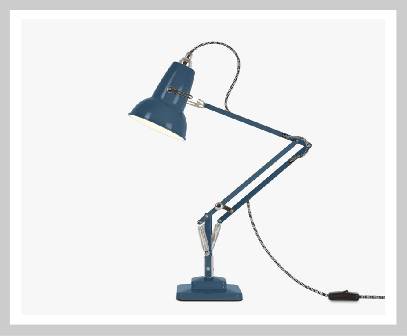
The Anglepoise lamp – George Carwardine, 1933
Automotive engineer, George Carwardine developed a theoretical concept using springs to create an articulated task lamp that could combine ultimate flexibility with perfect balance. A patent is filed and, in 1933 the first four-spring Anglepoise® lamp is launched. Find out more about the company by visiting anglpoise.com.
This is a beautiful piece of engineering. What I love is its industrial elegance. It doesn’t try to hide the mechanics within a sheath or try to overcomplicate the individual components. Each element is functional and together form a wonderful piece of design that adorns this designers desk both at work and at home.
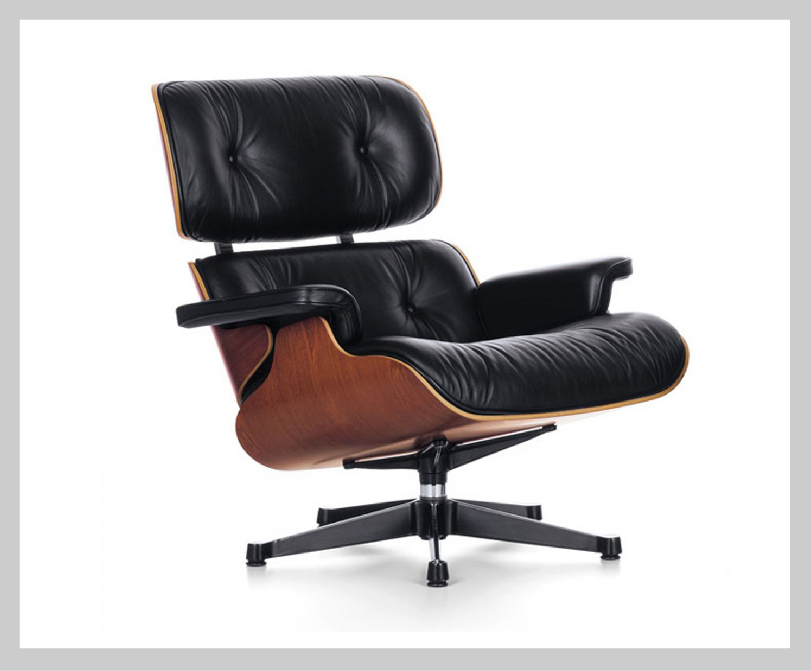
Lounge Chair No. 670 – Charles and Ray Eames, 1956
“You think I don’t want to pick you up right now, carry you over to that Eames classic and show you why it’s the best-engineered chair in the world?!” These were the words spoken by Kelsey Grammer in the hit TV show Frasier. It’s an hilarious scene but also one that speaks truth, paying tribute to the design classic and its engineering excellence.
This beautiful chair combines industrial production with hand craftsmanship in leather upholstery and a moulded plywood shell with a rosewood veneer that enables the chair to move with the sitter. Another example of form and function working in conjunction, not only is it exquisite to look at, the sheer pleasure of falling back into its comforting caress is sublime.
Its on my Santa’s list and has been for some time!
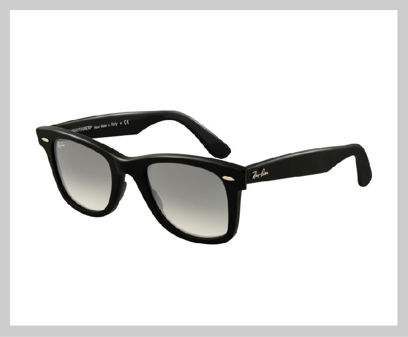
Wayfarer – RayBan, 1952
The Original Wayfarer are arguably the most recognisable style in the history of sunglasses. Some of the most memorable icons of the 20th century have adorned these classic spectacle; Mohammed Ali, Bob Dylan, JFK and not forgetting the fabulous ‘Blues Brothers’, Dan Aykroyd and Jon Belushi who wore the classic RayBans for the entire duration of the film by the same name.
I was first introduced to these style icons whilst watching the ‘Blues Brothers’ on a coach, travelling half way across Europe on a school ski trip. That trip was memorable for many reasons, one of which was trying to find a pair of Wayfarer’s in a small Austrian village in the middle of winter, and at a price a 15 year old boy can actually afford. In that respect, the trip was a disaster. Only 18 years later, and on another very memorable trip abroad, my wife (who I married only 14 hours earlier) brought me my first ‘real’ pair as a honeymoon gift. For that reason, if nothing else, they are a Classic.
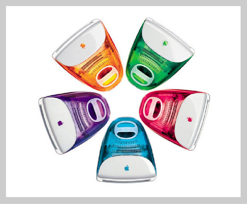
iMac (1st Generation) – Jonanthan Ive, 1998
The first generation of iMacs revolutionised the aesthetics of computers at the end of the 1990s and influenced the shapes and colours of all types of domestic electrical products.
Jonathan Ives’ innovation was to enclose the computer in translucent coloured polycarbonate rather than giving it a standard beige box, enhancing its presence and appeal to a broad market. No longer did your office (or home) have to be lifeless and banal, instead Apple shook up the computing world with lollipop coloured tech. Which flavour did you choose?
Colour is so important when creating a strong brand and is one of the first components of design that consumers associate with. We used a striking colour palette whilst working with an equally inspiring and innovative client Kispe when creating their brand identity.
There are many apple products that could easily be called a classic, the first-generation iPod or iPhone, but it is the iMac I have opted for as it really did change my life. Not only was it the first computer I purchased with my own money, I saved the extra £100 to purchase the purple version. It was then I realised, not only the power of innovative design, but also creative advertising and clever marketing. I will always look back on the iMac with a fond smile (and mouth-watering envy).
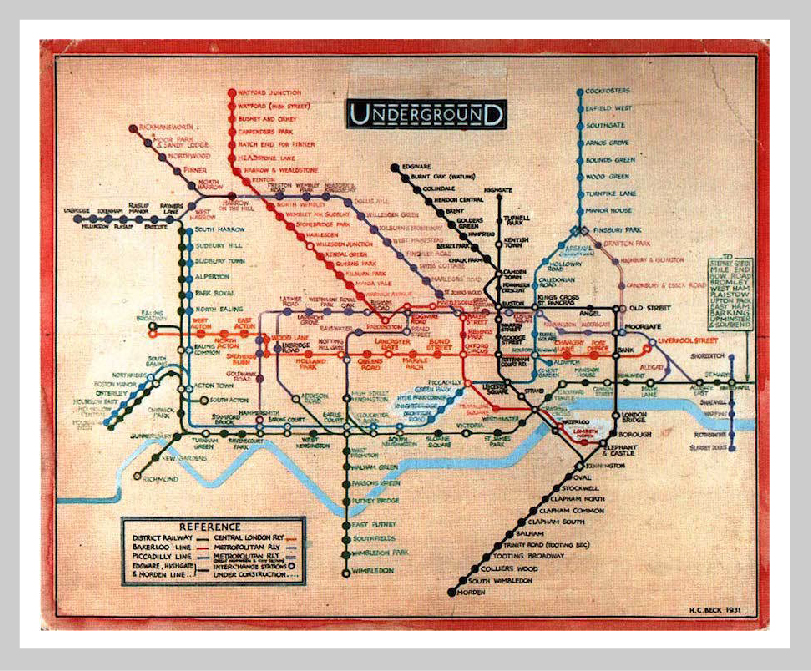
The Tube Map – Harry Beck, 1931
Darien Graham-Smith has written this wonderful ‘History Of The Tube Map’ which charts the development of the Underground map from 1908 to its present incarnation. The tube map is so iconic, it is hard to envisage it being drawn in any other way. Not only is it Londons own underground system that adopted this visual style created by Beck, but transport departments the world over have adopted the information system.
If you have ever visited a foreign city, and not become lost on its train or underground system, it will be thanks to Beck. It is the uniformity of information which makes it so effective. In Graham-Smith’s article he describes Beck ‘setting about on a project to “tidy up” the tube map by — as he would later recall — “straightening the lines, experimenting with diagonals and evening out the distance between stations”. It seems so simple not, but back in 1931, it revolutionised the way looked at information graphics.
To be a ‘classic’ it takes time. I would urge you to take the time to look at these designs and appreciate their practicality, their boldness but most of all their beauty. Similar to my look into the world of logo design, I discovered a new-found appreciation for these designs, coming to the same conclusion, that great design is built upon strong design principles and a desire to innovate through creativity.
Inspired by design.
Bob
Can we help you with a project?
Address
Mzuri Design Limited
Wolfe Mead
Farnham Road
Bordon
Hampshire
GU35 0NH
Contact
+44 (0)1428 722990
hello@mzuri.co.uk
Newsletter
Your email address
Thank you