
Designed to Inspire: Negative Space
APRIL 16, 2018
There has been a growing trend in the creative world of artists creating positive spaces and shapes that, in turn, cleverly carve out shapes in negative space. It’s not the easiest thing for a designer to achieve, but when they get it right, the results of two images being combined together into one seamless image give extra meaning and impact.
Negative space, simply put, is the empty or open space around an object that defines it. Just as important as that object itself, negative space helps to define the boundaries of positive space and brings balance to a composition. A creative design, incorporating negative space, is more rewarding for the viewer; they get a feeling of inclusion because they figured out a subtle hidden message or image.
Take a look at my article on Logos, particularly the FedEx logo as prime example of this. Inclusion is a key component in creating a strong brand. Look at any strong brand; Apple, Coca-Cola, Audi and you will see that they have created a community or tribe which you want to belong to. When you purchase or own one of their products, you become part of that tribe, you feel a sense of inclusion and that is incredibly powerful.
Enjoying little nuances
I have selected a few examples here that span logo design, advertising and illustration. Each has their own unique appeal, but there are little nuances in each that particularly grabbed my attention. I hope you enjoy them as much as I do.
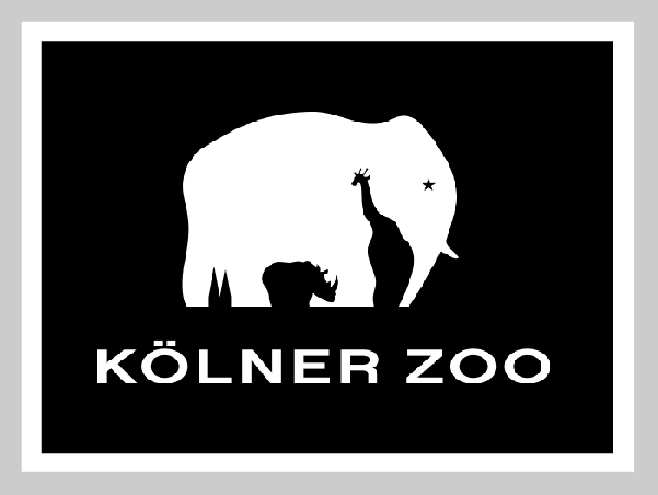
Designed by: Design Ahead
In the negative space below the elephant, you can find a hidden giraffe and a rhinoceros. These are the obvious ones, although they are sympathetically handled. It is the space between the elephant’s back legs that particularly intrigued me. Initially thinking it was just the elephants tail falling between the hind legs, but on closer inspection, it is shaped like the twin spires of the nearby Cologne Cathedral. I only identified this as I have visited that very Cathedral and found it striking whilst standing beneath it.
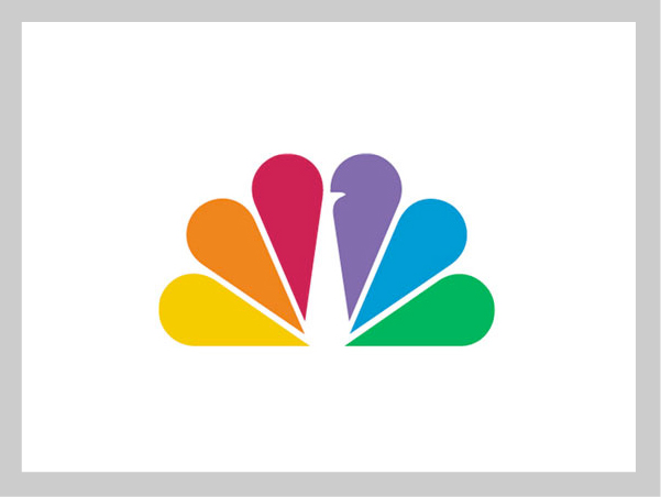
Designed by: John J. Graham (1956) and Steff Geissbuhler (1986)
The NBC peacock logo was on my shortlist to be included in my article on logos. It didn’t, only for the reason, that there were so many I wanted to include, so I am pleased to mention it here in terms of exquisite use of negative space (and colour). The original logo first created by John J. Graham in 1956, was later redesigned by Steff Geissbuhler at Chermayeff & Geismar in 1986. There are little subtleties in the new design – The peacock’s head now facing right suggesting it looking forward to the future, not back to the past. The colour palette simplified to incorporate the primary and secondary colours of RYB palette. This is a beautifully simple and elegant representation of a peacock and the broadcasting company it represents is a great example of negative space and refinement.
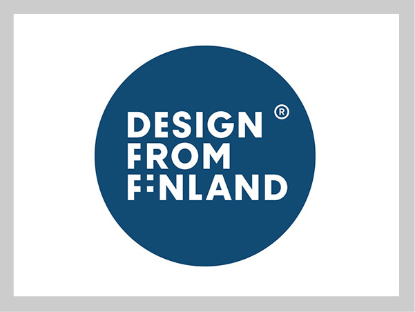
Designed by: Rasmus Snabb from Werklig
The ‘Design from Finland’ mark was introduced in 2011 to provide consumers in Finland and elsewhere with evidence of Finnish design excellence. This logo is a prime example of it! The subtle and clever use of negative space used in the typographic treatment of the ‘I’ is inspired. It turns the F and I of ‘Finland’ into a Finnish flag. Positively (and negatively) brilliant!
Designed by: Peter Vasvari
This was a logo designed for a production company (TV Design) located in Turkey. What I particularly like about it is the execution of the eyes. Yes, they double as the ‘C’ within the company name, but it is the shape and positioning of them at a slight angle which gives the logo a personality, a sense of inquisitiveness. The designer has not over worked them in order to make them form a more perfect ‘C’. A clever bit of typography, handled with skill and precision. In creating a strong and distinctive brand for Crystal Interactive, we too utilised negative space to define the letter ‘C’ and ‘I’ into one unique mark.
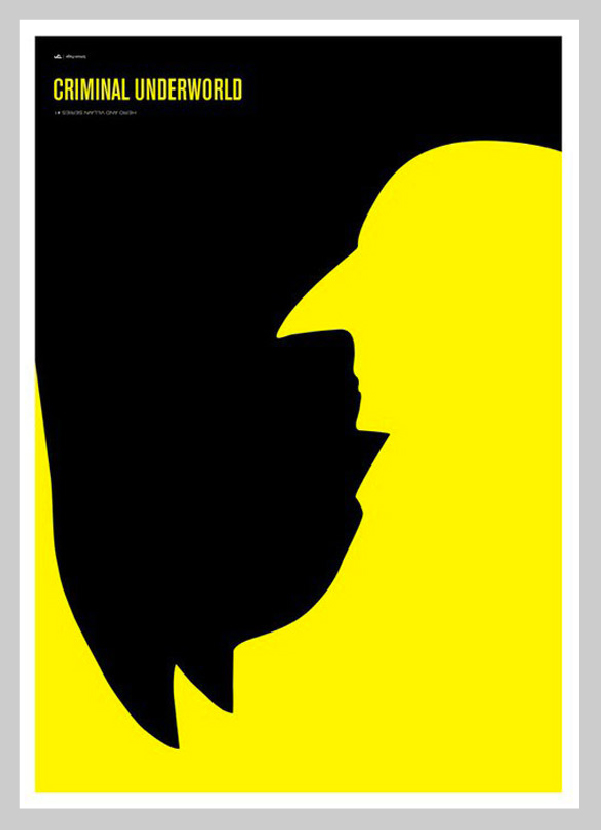
Designed by: Simon C. Page
This poster by Page is my favourite from his ‘Criminal Underworld’ series. Using the features of both characters to create the iconic silhouettes of the comic book characters has taken time and effort to refine. The long pointy nose of ‘The Penguin’ is an obvious feature, but refined to create the square jaw of the ‘Batman’. The pointed nose of the caped crusader also serves to create a small pointy chin adding to the evil persona of the arch criminal.
What I also love about this poster, is that works both ways up. I prefer it in the format shown above with the typography the correct way up as it serves to reinforce the nature of a bat (hanging upside down) and draws into question the true nature of the ‘Batman’ and his distorted position within the criminal underworld. It’s all a matter of perspective. Even if you are not a huge comic book fan, you can still appreciate the cleverness of the reversed silhouette and negative space.
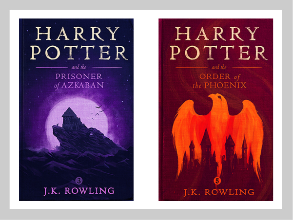
Designed by: Olly Moss
Illustrator Olly Moss is known for his smart use of negative space. This series of book covers were created for the first ever worldwide digital release of the Harry Potter series. They may look straightforward, but each one has a hidden message. I love the illustrative style, subtle use of colour to differentiate the book series as well as reinforcing the image and story behind it. Take a look at the full set on his site. If you like book covers, keep an eye out for an upcoming article I will be writing on them. Its a great medium for creative expression and Moss stands out amongst some of the very best.
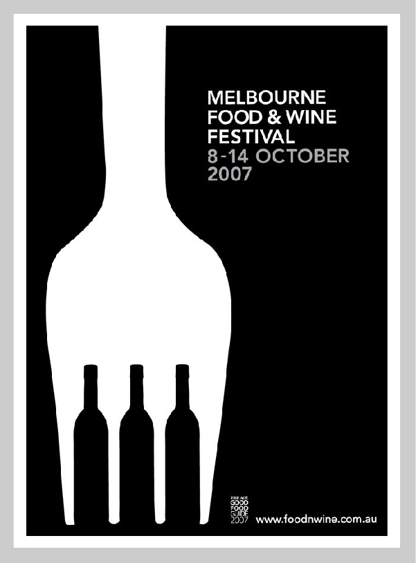
Designed by: Kaushik Design
Simple, elegant and instantly recognisable. This poster by Australian designer; Kaushik Shivanagere Badarinarayana uses negative space brilliantly. Another example of ‘less is more’, the bold icon and refined typography are so effective for use on a poster. So often, designers will over complicate a design by adding extra elements or colour and dilute the message. None of that here, Kaushik is confident and clear in his message and the poster is all the better for it. If you are interested in seeing some more inspiring posters, take a look at this article on poster design.
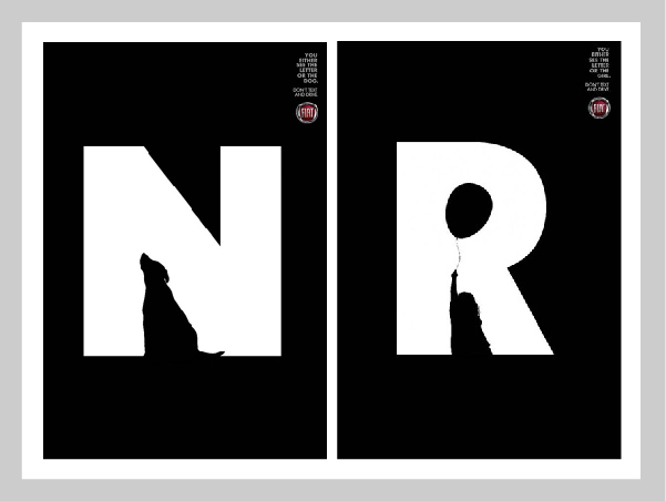
Designed by: Leo Burnett
This brilliantly clever campaign for Fiat is wonderful. Created by the Brazil studio, the series of ads encourages drivers not to text while driving. This is part of a series each with a large white letter which are accompanied by a graphic of a dog and a little girl in this case. Each illustration creating the defining shape of each letterform. The taglines state: ‘You either see the letter or the dog. Don’t text and drive.’ Subtle, clever, restrained – This is what good advertising should look like.
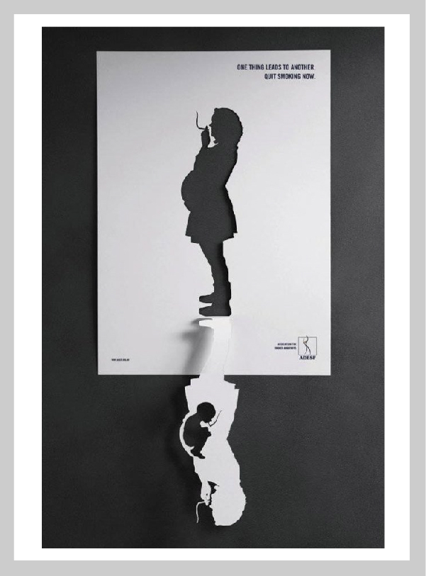
Designed by: Neogama BBH
Another Brazilian agency, Neogama BBH, made three prints highlighting the damage of tobacco in the long term. I have selected this example as great use of negative space, utilising the paper medium to ultimate effect. What I particularly like about it is the reflective qualities of the design drawing particular attention to the smoke and cigarette. We are all aware of the dangers of smoking, particularly for pregnant women, but this form of image making draws the viewer in to closely examine the true effects, highlighting that the baby itself ingests everything the mother does. Its subtle, but all the more impactful for it.
Whether it be a refined logo, a smart advert or a brilliant illustration, the clever use of negative space can add so much to a design. There are so many good examples of it out there, you just need to keep your eyes and mind open. Next time you look at your fruit based listening device, stare a little closer at the chunk taken out of it and see the similarity of shape and size of the leaf that sits above it. Or the next time you send or receive a parcel by FedEx, take a look at the space inside the letters and see if it points you in the right direction. Seeing what you know and knowing what you see are two entirely different things. It can really open your mind if you look a little closer at the designed world around you and invite you in to a hidden inclusive club.
Come join the tribe.
Bob
Can we help you with a project?
Address
Mzuri Design Limited
Wolfe Mead
Farnham Road
Bordon
Hampshire
GU35 0NH
Contact
+44 (0)1428 722990
hello@mzuri.co.uk
Newsletter
Your email address
Thank you