
Designed to Inspire: Book covers
SEPTEMBER 28, 2018
I am a regular listener of podcasts… An interesting way to start a post about books covers, I know, but they do allow me to explore some extremely interesting topics and people whilst on the daily commute.
One of my favourites podcasts is Design Matters with Debbie Millman, and searching through the back catalogue of recordings, I came across an interview with Peter Mendelsund, the associate art director at Knopf. I was drawn to this particular podcast as a client of Mzuri, Simon Cavvichia, recently had his book published ‘The Theory and Practice of Relational Coaching’ for whom we created the book illustrations. Sadly, the task of designing the book cover was in the hands of the publishers. I reflected on the missed opportunity, but also the incredibly difficult task of creating a cover that encapsulates an entire theme of a book.
This led me to ask several questions on how I would tackle such a complex brief which ultimately led me to explore the processes of one of the masters of book jacket design and gain an insight in to just how to start such an undertaking.
So, how do you capture an entire theme in a 15x20cm space? To answer this, I took a look at some great examples of book jackets (having great fun in the process) to see if I could establish any common traits or if you can tell a book by its cover and if beauty is in fact in the eye of the beholder. I suspect there are aspects of both, for what we see is influenced by what we know.
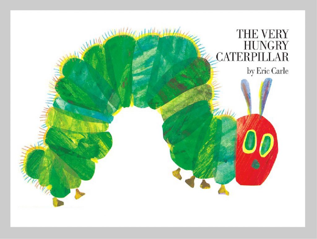
Book: The Very Hungry Caterpillar
Author and Illustrator: Eric Carle
We all know of this little furry fellow, at least I hope you do. It has adorned millions of children’s bedroom floors since 1969. If you have not seen it then I urge you to go out and get a copy as it is a real joy to experience, and the cover is a perfect example of this. The combination of painted paper collage with pencil drawn hairs, simultaneously giving a sense of naivety and illustrative mastery. The colours are vibrant yet realistic, and coming up to 50 years old, show no sense of fading or being any less engaging in the technicolour landscape of current colour trends. In fact, it’s reassuring to see that it is still the simplicity of the story and skill of the illustrator that makes this book as appealing today as it was in 1969.
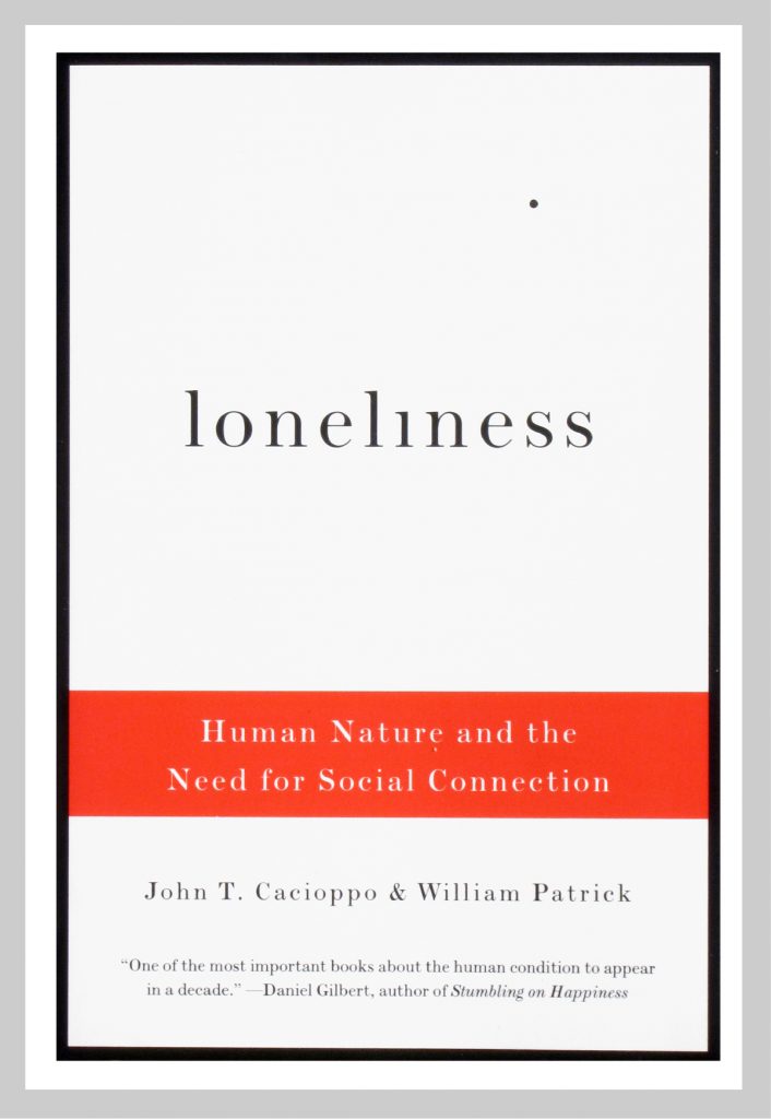
Book: Loneliness
Author: John T. Cacioppo & William Patrick
Designer: Peter Mendelsund
In stark contrast to the colourful nature of the ‘The Very Hungry Caterpillar’ is Mendelsund’s mastery of typographic restraint for the book ‘Loneliness’. At first glance it appears so effortless, possibly even obvious. However, you would be mistaken in thinking this. Whilst the final execution is restrained, the journey towards it is far more complex, each concept vigorously explored and experimented with.
In a Wired article by Kyle Vanhemert; ‘As Mendelsund describes it, his job is “finding that unique textual detail that…can support the metaphoric weight of the entire book.” That, of course, requires actually reading a manuscript closely enough to A) determine the metaphoric weight of the book and B) find a handful of relevant details within it. In other words, making a great book cover isn’t just about making. It starts with understanding.’
Understanding the brief is essential
In this way, the design of a book cover should mirror the process for designing any new product, album cover or a good logo. First you must gain a good understanding of the brief, that includes knowing the material you are working with, whether that be the manuscript, soundtrack, company core beliefs and history or the needs of the intended user.
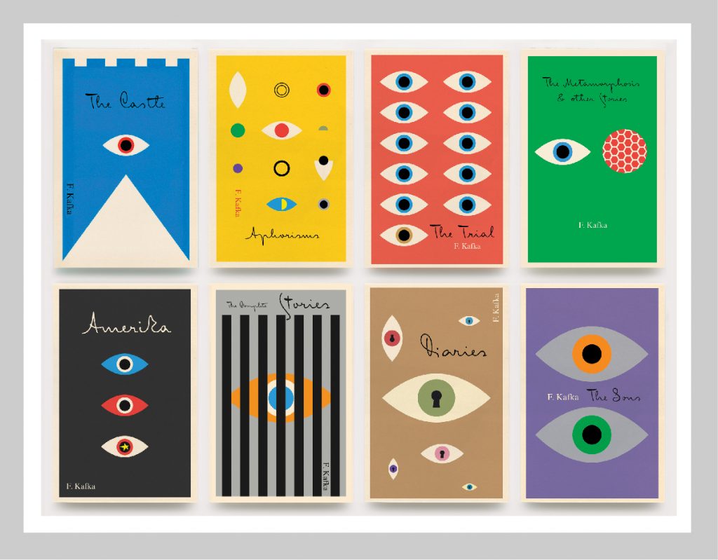
Books: Franz Kafka series for Schoken Books
Author: Franz Kafka
Designer: Peter Mendelsund
Alongside Mendelsunds mastery of the cover, Angus Highland deserves as much recognition. I particularly like his reworking of the Nabokov backlist. In an interview with Rebecca Greenfield, Highland states; “The thinking was to create a strong presence in Nabokov by having his own look and feel and to sort of play up the playfulness and seductiveness and wickedness of his style,” Hyland explains, “rather than the usual tackle of Nabokov, which is much more high-literature.”
I particularly like the re-composition of classic components that were commonly used in the Penguin 20th Century Classics series, from the 1990s. Utilising a recognisable composition and using bespoke patterns, whilst breaking the framing element with overlapping imagery and the use of different illustrators give each book an individual look under a unifying theme.
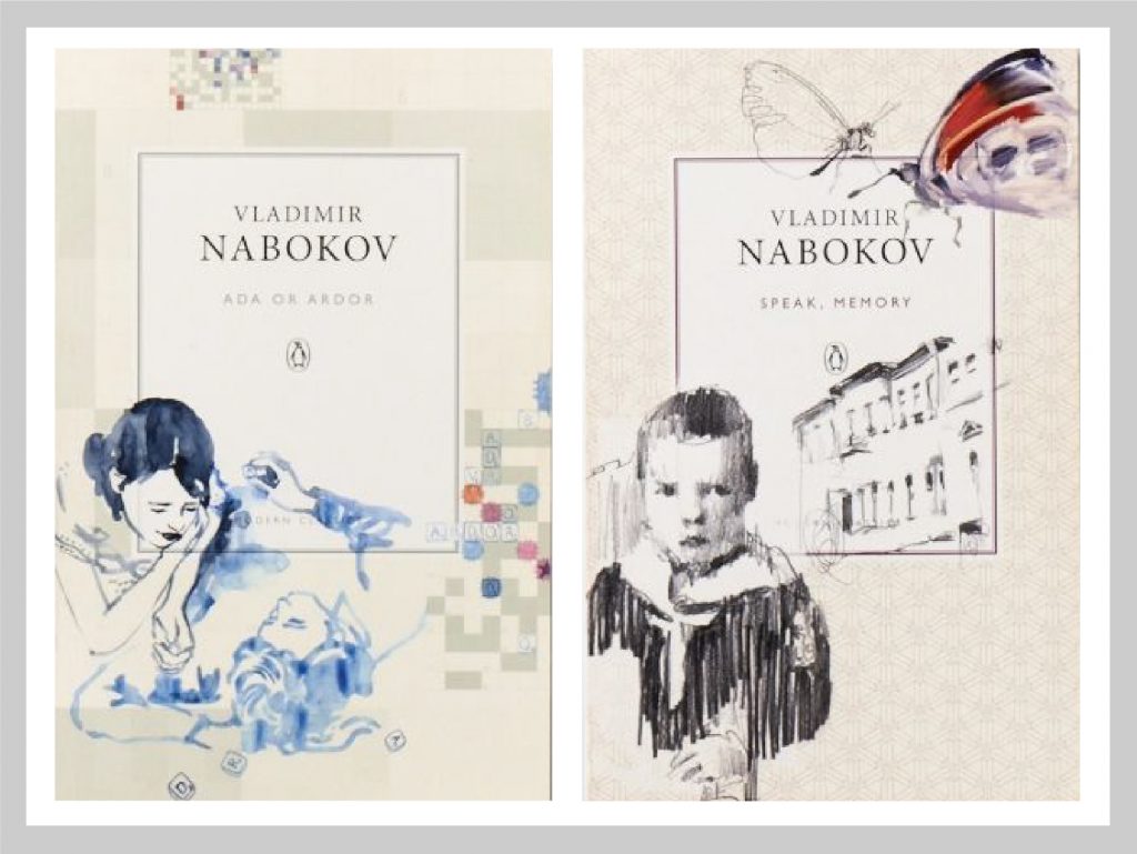
Book: Nabokov Penguin Modern classics
Author: Nabokov
Art Director: Angus Hyland.
Illustrator: Agnès Decourchelle (Ada or Ardor), Alan Charming Baker (Speak, Memory)
Creating clever and engaging covers
Penguin books are synonymous with creating clever and engaging covers, none better than this highly sought after edition of ‘Nineteen Eighty-Four’ by George Orwell. A fantastic novel which looks into the world of ‘Big Brother’. This depiction by designer David Pearson hides the Author’s Name and the title of the book itself, only the embossing of the lettering can be seen underneath the black panels, which link excellently to the theme of censorship throughout the book.
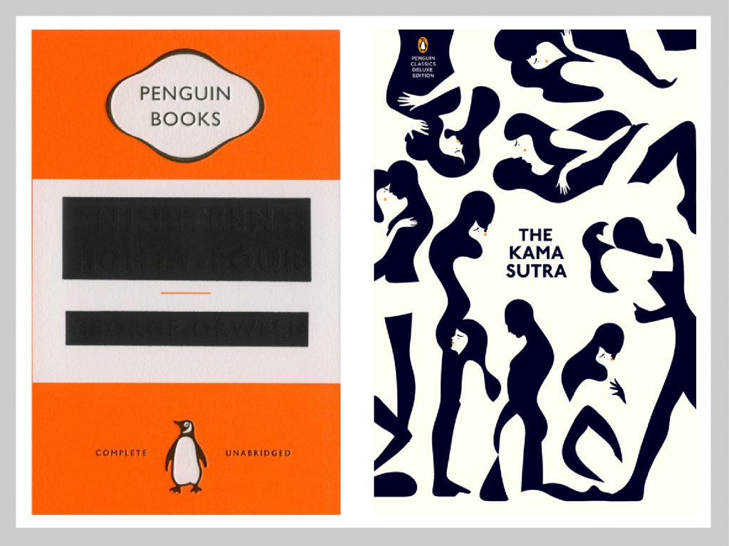
Book: 1984
Author: George Orwell
Designer: David Pearson
Book: The Kama Sutra
Designer: Malika Favre
Another bold use of negative space was Malika Favre take of the Kama Sutra for Penguin. The clever use of intertwining silhouettes is a subtle yet direct interpretation of the ancient Sanskrit guide to sexual technique, human sexual behaviour and love. The use of a restricted colour palette and simple forms only serves to enhance the impact of the cover.
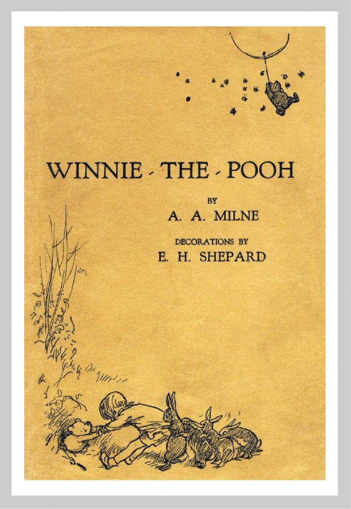
Book: Winnie the Pooh
Author: A. A. Milne
Designer: E. H. Shepard
Returning full circle, take a look at another book from my childhood that I still admire to this day. Although this is not the cover version I experienced as a child, when I came across it at Art college, this original version is eclipsed any subsequent adaptation. Like all the covers featured in this article, it’s the overarching concept, thought process and skill of the designer that is key to the success of the cover. The directness of the illustration and simplicity of execution is what makes this cover a real triumph. Shepard’s depiction of the little bear so eloquently captures the personality Milne created in his book. The quiet little bear who often finds himself getting into ‘spots of bother’ is brilliantly realised in the split illustration that perfectly frames the book title and author. The cherry on top for this cover is actually the lack of one. The monotone colour palette is due to financial constraints as opposed to a creative decision, but is all the better for it.
A real source of inspiration
One of the reasons I wanted to write a piece on book covers is that they are such a wonderful source of inspiration for me. Much like posters and album covers, they offer so much scope for creativity and the ability to use different mediums to convey a message. Photography, illustration, graphics and typography all come together in this wonderful artform. It’s the results of this creativity, skill and discipline that are so satisfying. In the rapidly expanding disposable digital universe, to create something physical and tangible that you hold and covet and want to display on your very own bookshelf is incredibly heartening.
From ‘The Very Hungry Caterpillar’ to ‘Winnie the Pooh’ and every magnificent dust jacket in between, conceptual intellect, visual restraint, illustrative mastery and typographic discipline come together to form the basis of these design gems. Forget the banality of the vast swathe of ‘New York Times Bestseller’ mass produced template covers that adorn the end of a supermarket shopping aisle. Instead visit an independent book store and pick up a book that you have never heard of but visually intrigues you. If you don’t understand the cover on first glance, don’t be discouraged. Read a little further and on completion you will find a wry smile cross your lips as your synapses spark and connect the written word with the visual image.
Thank you to all you creative geniuses out there. I shall be looking for your latest creations in a local bookstore near me this weekend.
Bob
Can we help you with a project?
Address
Mzuri Design Limited
Wolfe Mead
Farnham Road
Bordon
Hampshire
GU35 0NH
Contact
+44 (0)1428 722990
hello@mzuri.co.uk
Newsletter
Your email address
Thank you